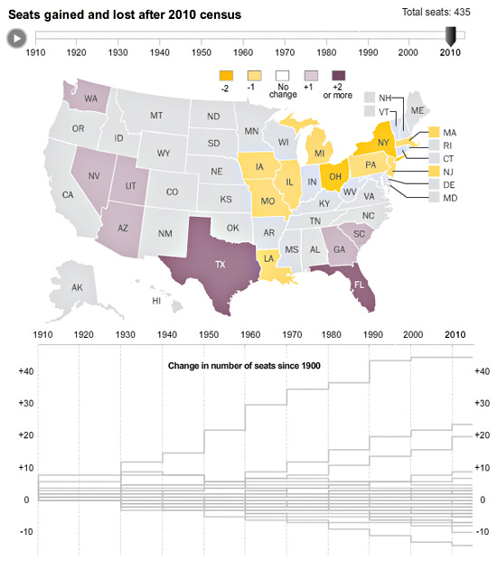
With Tuesday’s apportionment announcement, we decided to create an interactive map that would look at reapportionment over time. Census also created a map like that here.
Gene Thorp created a cartogram with the data that appeared on page 1 of the newspaper — you can check that out here.
