Sin Luz

Published in The Washington Post, December 2017


I was a lead editor and project manager on this story, which showed the difficulty of life without power after Hurricane Maria devastated Puerto Rico, and the resilience of the Puerto Rican people as they dealt with the challenges.

Sin Luz

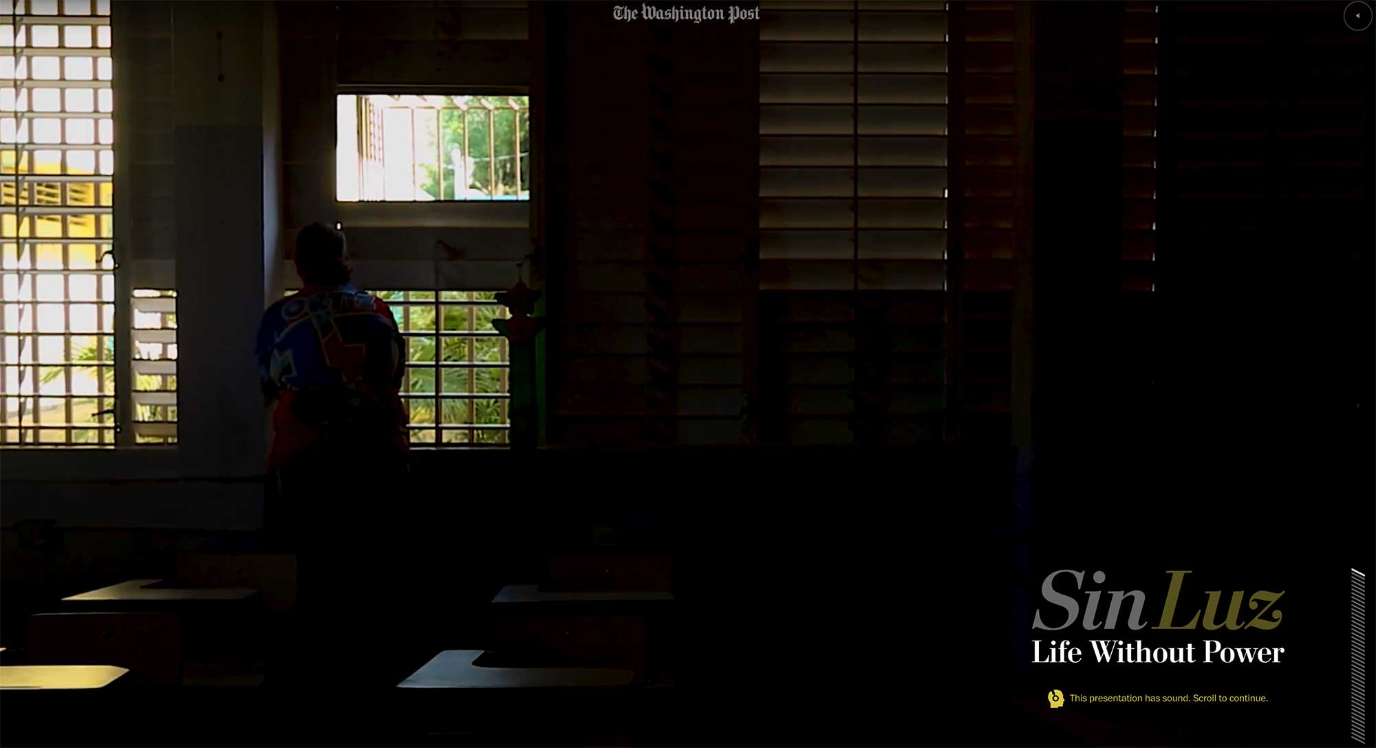
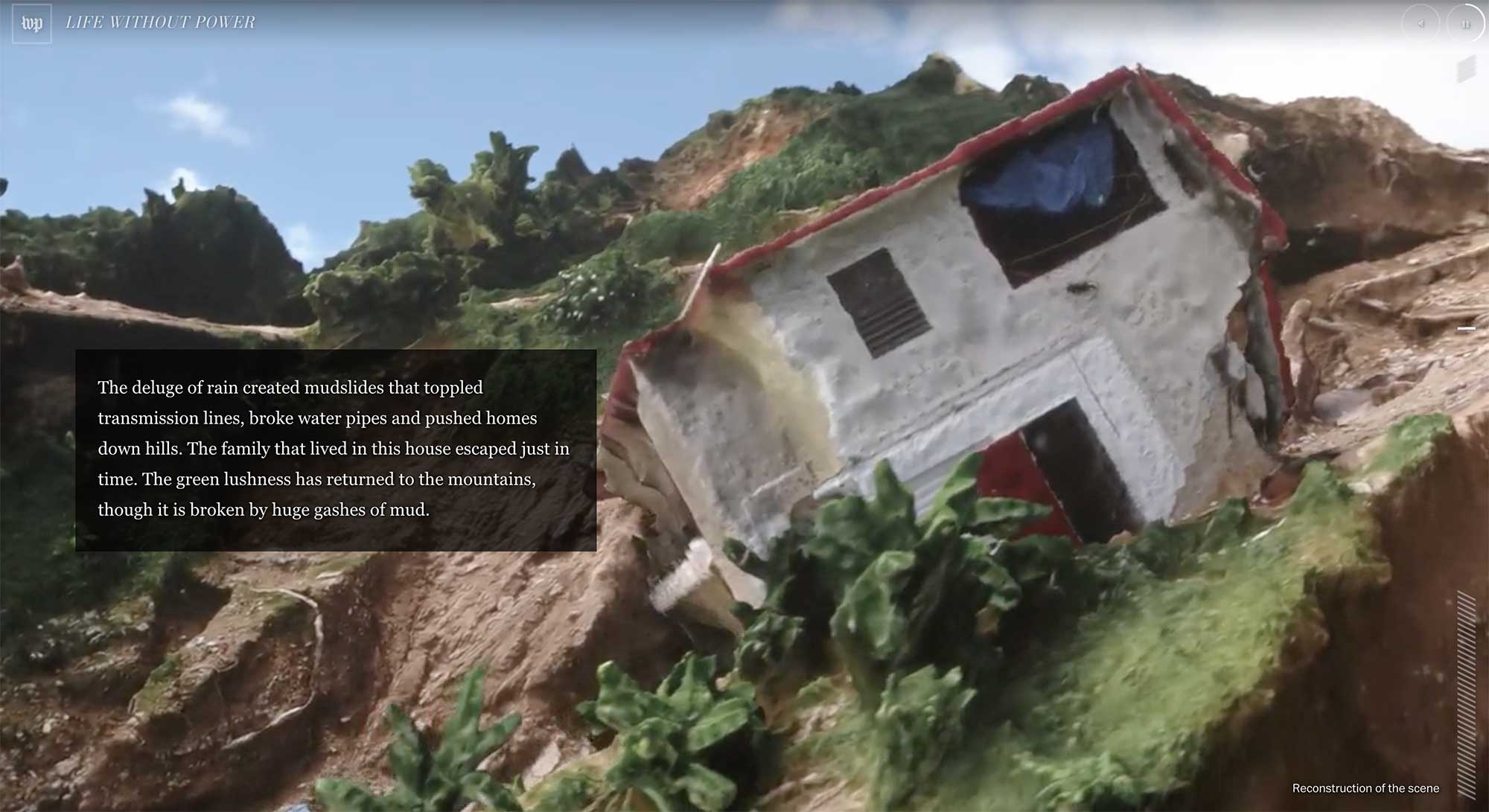
In addition to smart user interface design and an incredibly powerful story, we created 3-D terrain maps of the island and used photogrammetry and drone footage to recreate the scene.

Role: Editing, project management

Awards: World Press Photo, Immersive Storytelling, second prize

Visually communicating uncertainty: An experiment

I was just reading this article by Nate Silver in fivethirtyeight, which explores the different ways journalists miscommunicate probabilities.

This particular sentence caught my interest: “People associate numbers with precision, so using numbers to express uncertainty in the form of probabilities might not be intuitive.”

So, what if we tried to visually communicate that imprecision. Instead of 25.4 percent, which feels very solid, we represented it as 25.4 percent.

An amazing year

It’s been such a pleasure to see the team develop and thrive this past year. This compilation of graphics from the 2016 election cycle is a tribute to the talent, commitment and drive of the team. Check it out:

2016 election graphics

Washington Post graphics in Best American Infographics 2015

Best American Infographics 2015

The Best American Infographics book, edited by Gareth Cook, came out in October. The Washington Post had our best showing yet, with 10 of our graphics featured. The best thing is that so many of our @PostGraphics team members are represented — at least 11, which is about half the team!

A few pieces that were featured that I edited:

Weapons and mass shootings: Richard Johnson, Bonnie Berkowitz, Ted Mellnik, Todd Lindeman and Kennedy Elliott
Screenshot 2015-12-12 21.12.04

When drones fall from the sky: Alberto Cuadra and Emily Chow
Screenshot 2015-12-12 21.02.31

Wizards shooting stars: Beautiful work from Todd Lindeman and Lazaro Gamio
Screenshot 2015-12-12 21.06.01

Favorite work from 2014

Some of the projects I’ve loved this year:

Health hazards of sitting: One day I said to Bonnie that we should do a graphic about how bad sitting is for you (was feeling bad about sitting all day!). She, as usual, simply said “I’ll look into it” and then, with Patterson’s help, made this amazing thing, which was one of our most popular pieces of content this year.
sitting

Pistorius affadavit: I developed this project that has some amazing artwork by Todd Lindeman and Richard Johnson
pistoirus

Flight 370 timeline: I developed the little locator map on this project!
20140323-MalaysiaAir

Secret service: Sam Granados had the vision for this project, which is a smart mix of media types that tells the story of the night bullets hit the White House and the Secret Service didn’t know. I helped with some of the design and development of the piece.
20140928-WhiteHouseShootings

Intensive Care for a Damaged Dome: Fantastic project by Alberto Cuadra, Sohail Al-Jamea, Katie Park and Kevin Schaul that I edited.
Screenshot 2015-12-12 23.22.40

Election Lab: Fun election project designed by Kennedy Elliott that I edited:
2014-10-28 14-electionLab

The N-word project

201411-NWord

This project, which was nominated for the OJA for Excellence and Innovation in Visual Digital Storytelling, was months in the making. It happened only through an enormous amount of collaboration between people from different desks, disciplines, races and perspectives. We decided to examine the history of this word after the NFL instructed game officials to penalize players who used the word on the field. The policy was widely criticized as being heavy-handed and out of touch. We wanted to start a conversation about the word and to bring in the voices of all kinds of people with different perspectives on this word and the ways it is used today — whether and how it should be used, who can or should use it, what it means in people’s lives.

Inside the newsroom, the project brought together a wonderfully diverse group, who spent months exploring the best way to tell this story, ultimately deciding that we wanted to present it through a series of conversations that brought people together to talk about things they might not normally be comfortable talking about. We created something that we all felt proud of, that opened us up to conversations among ourselves that challenged our assumptions and taught us all more about each other. It gave our readers a place to start asking uncomfortable questions and talk about what this word means in their lives.

New homicides map

We just launched this interactive map with details about 2,294 homicides that occurred in D.C. between 2000 and 2011. You can find the killings in your neighborhood, follow the trends over time, and learn how the victims died and what happened to their cases.

Key findings featured in the graphic:
Click the headline to jump straight to that view in the map.

Homicides in D.C. are down 55 percent since 2000
The number of homicides in the District fell last year to 108, a 49-year low. Despite the decline, homicide continues to be a tough crime to solve and prosecute in the city.

Motives: Drug killings down 84 percent
The most common motives for homicide in D.C. are arguments, drugs and retaliation. About 2 percent are classified as gang-related. Homicides involving drugs have decreased about 84 percent since 2000. Drug-related homicides accounted for eight of the city’s killings last year, compared with 49 in 2000.

Most dangerous age: 24 percent of those killed were in their early 20s
More than half of the District’s homicide victims between 2000 and 2011 were between the ages of 15 and 29. About 93 percent of those victims were male, and 94 percent were African American.