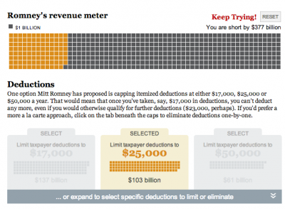
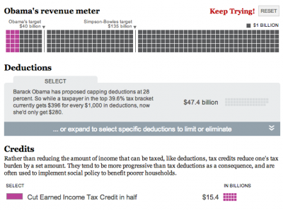
This week we launched two new interactives embedded in Ezra Klein’s blog, Wonkbook. Ezra and Dylan Matthews put together the information, Todd Lindeman designed it and Andrew Metcalf built it. I helped with styles, etc. It’s a fun experience, and I love that it’s built for the blog. Check them out!
New year, new post
It’s been a busy few months, but I’m gonna squeeze in a post for January! I’ve switched jobs at the Post and moved into a new role, Interactive Projects Editor, focusing on creating interactive projects that combine design and graphics with video, photography and social media. I’m really looking forward to the new challenge. In other news, I’m getting used to the new delicious and trying out this ‘stacks’ thing. I’ve got a few going, namely one on interactive maps and one for games and quizzes. I’ll keep those updated as I collect links around the web. And, some of my recent work….
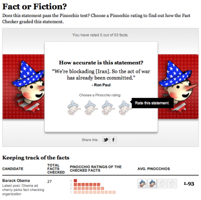
Pinocchio tracker
The tracker part of this was originally done with Tableau, but we decided to rework it and to add a game element to it. It’s on a page of its own as well as in the right rail on all our politics content. Try it out!
The Media Divide
This piece was born from a project by Marc Fisher to track what media people consume in a day and see how it reflects their ideology. Evelio Contreras did this great video and we put it together in a calendar with links to all the news they watched/read/listened to, and combined that with a poll.
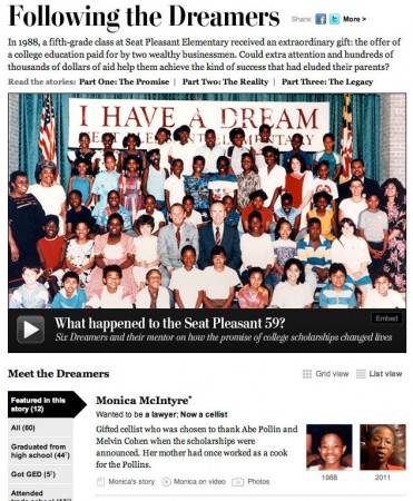
The Seat Pleasant 59
This project leads with Whitney Shefte’s awesome video about a class of students who were promised that if they graduated from high school, their college would be paid for. We tracked down the students and found out where they are now. My contribution was the list/grid view and filtering along with itemizing content for each of the dreamers.
Analyzing the U.S. tax code, break by break, and other recent charts
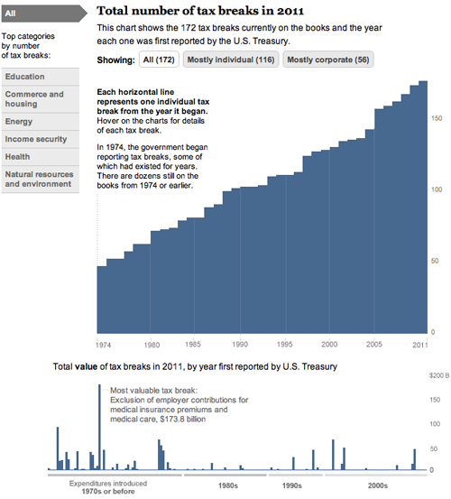
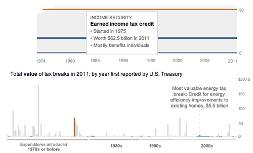
Today, we came out with a new graphic that looks at the tax breaks on the books this year. It is part of Running in the Red, a series the Post has been running for the past few months, and accompanied Lori Montgomery’s front-page story, “Ever-increasing tax breaks for U.S. families eclipse benefits for special interests,” a great story that explains spending through the tax code.
The graphic is all CSS and JavaScript. With charts that only have bars, it’s simple to dynamically add sized divs with background colors that create charts. The data will update automatically if necessary and it works across all browsers and mobile platforms with no workarounds:
And has details for each of the 172 breaks currently active (see below). Added bonus: I learned a ton about the tax code.
And a couple more (relatively) recent charts:
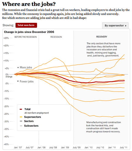
This one I worked on with Alicia Parlapiano and Neil Irwin. Because I wanted to create animate transitions and interactivity, I used Flash to create this graphic. It has detailed drilldowns to look at employment in each sector of the economy. I tried to inject more annotation into this graphic (and the taxes one above) than we have done in the past with data-driven graphics. Instead of throwing a bunch of data out there, we’re providing more context and guided views — by category and by sector versus a completely self-guided data dive.
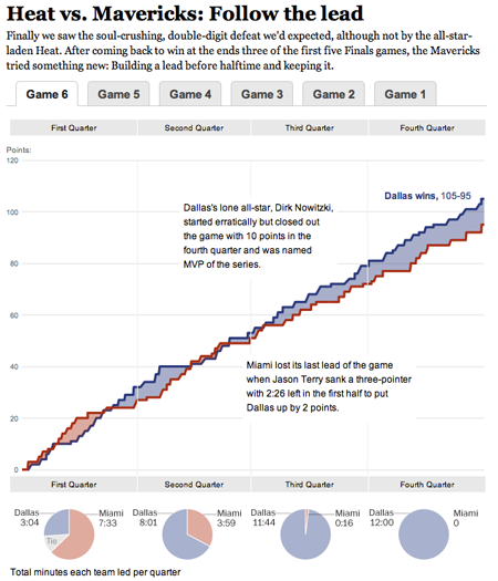
This was a fun chart I helped our intern, Heather Billings, with at the beginning of the summer. We used flot to make these charts showing how the lead changed between the Heat and the Mavericks during the NBA finals. This was particularly fun for me because I got really into the NBA finals this year and watched every game. I know, hard to believe, but true. I was a having a great time analyzing the outcome of the games and reading all the news — and if you missed it, this was a great article from Bill Simmons at Grantland.
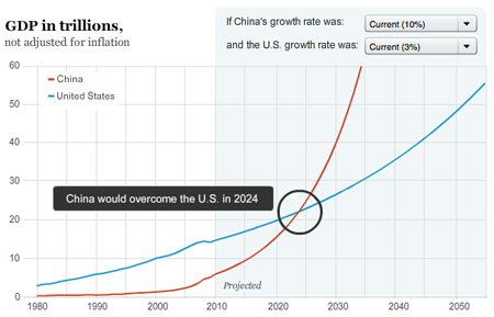
And another one about when and if China’s economy will pass the United States to become the world’s largest.
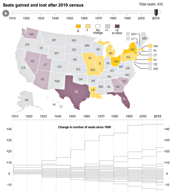
Census apportionment over time
With Tuesday’s apportionment announcement, we decided to create an interactive map that would look at reapportionment over time. Census also created a map like that here.
Gene Thorp created a cartogram with the data that appeared on page 1 of the newspaper — you can check that out here.
Creating Live Election Results Maps
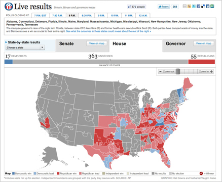
On Nov. 2, midterm election day, we put up these maps that tracked the results as they came in. For Senate and Governors we had state and county-level data, and we had House districts as well. This suite of maps was published in The Washington Post, as well as on Yahoo! News and the Telegraph (UK). The maps have balance of power charting and tabular results as well as zooming and deep linking features. Read more about how we built the maps »
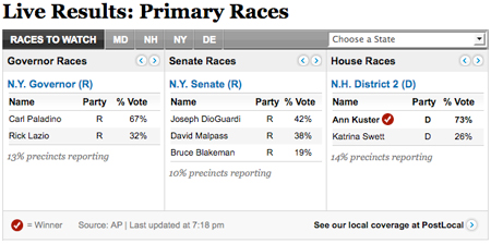
Live results widget
In preparation for the September 14 primaries, I designed this widget for the Politics front. It features house, senate and governors races that auto advance, as well as races to watch, and allows you to see all the races in one convenient spot. It was actually built out by a contractor, Zvi Band of SkeevisArts. We used it on the politics front as the live results came in, and will be able to re-purpose it for future elections.
Top Secret connections
After a full year of working on various aspects of the Top Secret America project, we have finally launched! Check out the full project at topsecretamerica.com.
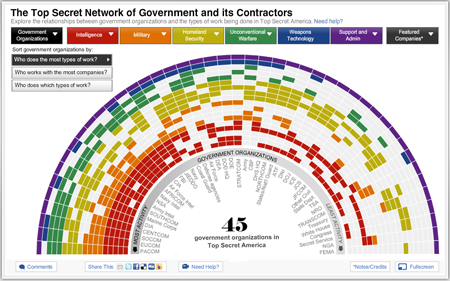
I worked on a whole bunch of aspects of this project and did a lot of brainstorming and storyboarding, but my primary focus was the interactive “network connections” graphic. In the beginning we wanted to create a graphic that illustrated the redundancy and size of Top Secret America and had a ton of data in it, while not being overwhelming. Read more »
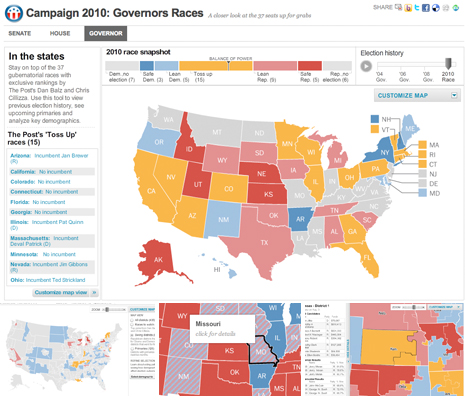
2010 Political Race Maps: House, Senate and Governors
These three new race maps (house, senate, and governors) launched today with the new PostPolitics section of The Washington Post. I worked with Karen Yourish and Dan Keating, who are absolutely amazing data whizzes, to get the data together for the project, and Nathaniel Vaughn Kelso gave me some great base maps to start with. We really wanted to give a complete picture of the 2010 races, so we have current race ratings (for house, we have state of the race), election history for each district or state, and demographic information that lets you see some cool patterns — like how states vote when they have a high percentage of seniors or high poverty rates. Keep reading this post »
New county map: Ultra-high Medicare Billing Rates
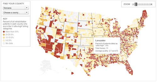
I re-purposed the unemployment map for this story about ultra-high billing rates at skilled nursing facilities in the U.S. It shows where facilities are billing ultra-high rates. The Washington Post found that nursing homes have flooded ‘ultra-high’ billing categories with patients, and the amount of waste and abuse could reach billions of dollars a year. Check out the graphic or read the story by Scott Higham and Dan Keating.
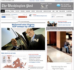
Virginia Election Coverage
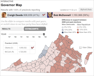
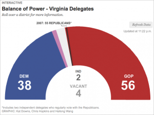
I worked on two graphics for the recent election in Virginia — a map that shows the results of the 2009 governor’s race and election results back to ’97, and a delegates meter showing the balance of power in the VA House of Delegates.
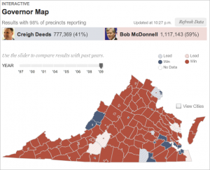
The governor map showed live results throughout the night, and at the end of the night historical results showed up as well, so that users could look at how voting patterns have shifted since previous elections. I think this was really interesting given the speculation about how the 2008 presidential election might impact this year’s race in Virginia.
The delegates meter was a quick piece, I just used some circle drawing math in AS3 to create 100 segments in a half-circle, and fill them in as the results came in. When you roll over the segments, you see current results for that district.
I made small versions of these graphics to go on our local homepage on Tuesday night and Wednesday morning. They were simplified versions that linked out to the full graphics. I think that was a smart way to push traffic to our graphics on election night, while giving casual viewers a current tally of results.
