This week we launched two new interactives embedded in Ezra Klein’s blog, Wonkbook. Ezra and Dylan Matthews put together the information, Todd Lindeman designed it and Andrew Metcalf built it. I helped with styles, etc. It’s a fun experience, and I love that it’s built for the blog. Check them out!
New homicides map
We just launched this interactive map with details about 2,294 homicides that occurred in D.C. between 2000 and 2011. You can find the killings in your neighborhood, follow the trends over time, and learn how the victims died and what happened to their cases.
Key findings featured in the graphic:
Click the headline to jump straight to that view in the map.
Homicides in D.C. are down 55 percent since 2000
The number of homicides in the District fell last year to 108, a 49-year low. Despite the decline, homicide continues to be a tough crime to solve and prosecute in the city.
Motives: Drug killings down 84 percent
The most common motives for homicide in D.C. are arguments, drugs and retaliation. About 2 percent are classified as gang-related. Homicides involving drugs have decreased about 84 percent since 2000. Drug-related homicides accounted for eight of the city’s killings last year, compared with 49 in 2000.
Most dangerous age: 24 percent of those killed were in their early 20s
More than half of the District’s homicide victims between 2000 and 2011 were between the ages of 15 and 29. About 93 percent of those victims were male, and 94 percent were African American.
Washington Post Olympics graphics and multimedia roundup
Here’s some of what the WaPo team put together for the London Olympics:
The definition of perfection
I designed this piece about how gymnastics scoring worked. Wilson Andrews developed it and edited/animated the videos, and Bonnie Berkowitz did the writing.
Profiles in Speed
This six-part series we developed in the run-up to the Olympics featured greats like Missy Franklin, Michael Phelps and Carmelita Jeter. Videos, infographics, and awesome articles. I especially love the segment on technology.
Are you over the hill for Olympic sports?
As part of the Profiles in Speed series, I developed this graphic which lets you see where you fit into the Olympic age spectrum. Flowing Data wrote about it here.
New year, new post
It’s been a busy few months, but I’m gonna squeeze in a post for January! I’ve switched jobs at the Post and moved into a new role, Interactive Projects Editor, focusing on creating interactive projects that combine design and graphics with video, photography and social media. I’m really looking forward to the new challenge. In other news, I’m getting used to the new delicious and trying out this ‘stacks’ thing. I’ve got a few going, namely one on interactive maps and one for games and quizzes. I’ll keep those updated as I collect links around the web. And, some of my recent work….
Pinocchio tracker
The tracker part of this was originally done with Tableau, but we decided to rework it and to add a game element to it. It’s on a page of its own as well as in the right rail on all our politics content. Try it out!
The Media Divide
This piece was born from a project by Marc Fisher to track what media people consume in a day and see how it reflects their ideology. Evelio Contreras did this great video and we put it together in a calendar with links to all the news they watched/read/listened to, and combined that with a poll.
The Seat Pleasant 59
This project leads with Whitney Shefte’s awesome video about a class of students who were promised that if they graduated from high school, their college would be paid for. We tracked down the students and found out where they are now. My contribution was the list/grid view and filtering along with itemizing content for each of the dreamers.
Moving away from Flash: A look at JavaScript drawing libraries
Excerpts from a new post for WP’s @innovations blog:
[Go to the blog to read the whole thing]
When Apple announced early last year that it would not support Flash on the iPhone and iPad, a passionate conversation erupted in the world of web development: Was Flash dead? If not, how would it survive? When should it be used? News developers asked these questions as well, and, at least in our newsroom, the conversation inspired some thinking about how to approach interactive development. Over the past year and a half, there has been steady movement toward more interactivity based on JavaScript and fewer Flash-only experiences.
Last week we published a graphic that compared four federal budget proposals through a series of charts. We used the jQuery library Flot to draw simple, interactive line charts that showed how the debt and deficit would change under the different plans. Flot is very easy to use, flexible and customizable, and is one of many free-to-use JavaScript graphing libraries out there (Dracula, Highcharts and RGraph are a few others). We also built a customized chart with CSS and JavaScript at the bottom of the page to show how different categories of spending would be affected.
Mapping the news: Libya and Japan
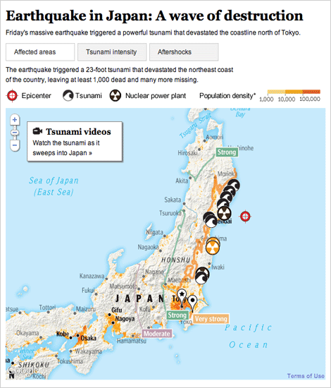
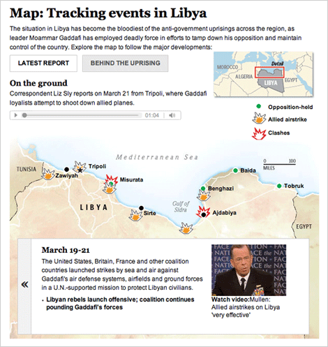
The past several weeks have been full of foreign news, and we have been producing lots of graphics to explain what’s happening. I have worked on these two graphics, one about the earthquake and subsequent tsunami in Japan, and one that explains what is going on in Libya.
For a full explanation of the process of creating the Japan graphic, visit the new Innovations blog at the WP (excerpted below):
Friday morning, as news of the earthquake in Japan spread, we started pulling together an interactive map that would show readers where and how events unfolded. Over the next 36 hours, we would continually expand and improve the information, design and interactivity of the map as the news of the earthquake and tsunami came in. Read more »
For Libya, we combined an event tracker with audio and video from the ground. The reports from correspondents on the ground is my favorite part.
Both graphics are done using javascript and jquery, so check them out on your tablet devices!
Census apportionment over time
With Tuesday’s apportionment announcement, we decided to create an interactive map that would look at reapportionment over time. Census also created a map like that here.
Gene Thorp created a cartogram with the data that appeared on page 1 of the newspaper — you can check that out here.
Creating Live Election Results Maps

On Nov. 2, midterm election day, we put up these maps that tracked the results as they came in. For Senate and Governors we had state and county-level data, and we had House districts as well. This suite of maps was published in The Washington Post, as well as on Yahoo! News and the Telegraph (UK). The maps have balance of power charting and tabular results as well as zooming and deep linking features. Read more about how we built the maps »
The Cost of War

This past Sunday “Coming home a different person” launched, a project I worked on with Whitney Shefte and Alberto Cuadra, alongside reporter Chris Davenport. It features an overview video that covers the increases in traumatic brain injury cases and what doctors are doing to treat it, as well as five case studies of three soldiers and two Marines, and a graphic that explains the science of brain injury.
I initially heard about the story Chris Davenport was working on and thought, wow, this is an amazing multimedia opportunity. I went to Whitney and asked her if she’d like to work on it with me. We huddled with Chris and storyboarded out a basic flow for the intro video and the entire piece — how it would be structured and how we should integrate the graphics with the videos. Read more about how we developed this multimedia piece »
Alternative story formats: Investigation into Alaska native corporations

This investigation, which launched September 30, focused on Alaska Native Corporations and their explosive growth during the last decade. I combined photos, graphics and video in a multimedia slideshow. The intention was to build a relationship between the corporations and the shareholders they represent. Alaska natives are some of the nation’s poorest people, and some of the corporations that were supposed to be helping them make their way have instead been funneling money back to contractors in Washington.


