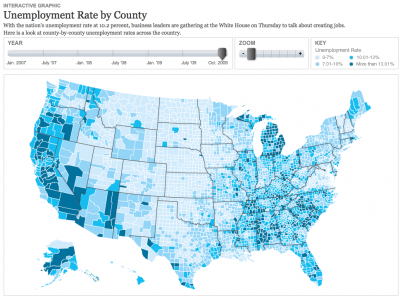
After many months talking about how we wanted to produce a nationwide county map, we finally had a project come up that called for one with a quick turnaroud — one and a half days! With a great base map by Nathaniel Vaughn Kelso, I created this United States county map that shows unemployment from 2007-2009. This is an early version, so there’s a lot of improvements to make, but I think it’s a solid start, and I’m happy we turned it around as fast as we did. I used classes I created for the helicopters state map and the Virginia governor’s race map to make the build much easier.

D.C.’s unemployment rate was 12.1% in Oct. 2009 — really high. Macon County, where Franklin is, had an unemployment rate of 10.3%. We’ll keep adding to this map as time goes on, and I think it’ll be really interesting to see what happens with jobs and the economy over time.