I worked with Dana Priest to write the script and I recorded the voiceover and did all the animation in After Effects. I created the graphic with maps made by Nathaniel Vaughn Kelso. I’ll write more later about the concept and execution. Let me know what you think!
After a full year of working on various aspects of the Top Secret America project, we have finally launched! Check out the full project at topsecretamerica.com.
Who's involved in the most types of work?
I worked on a whole bunch of aspects of this project and did a lot of brainstorming and storyboarding, but my primary focus was the interactive “network connections” graphic. In the beginning we wanted to create a graphic that illustrated the redundancy and size of Top Secret America and had a ton of data in it, while not being overwhelming. Read more »
I worked on this graphic with reporters Josh White and Maria Glod, who collected an incredible amount of information on the East Coast Rapist, a man who has been on the loose for 13 years and is a suspect in 17 cases. For this important story, I organized the data that Josh and Maria collected into an easy-to-use interface that had the details of each case, including a small photo gallery, a google map, a quote and all the case information. I built an interface that drew connections between the cases and allowed people to sort the cases by date, location, existence of dna samples, and the weapon used. It also featured a map interface, a gallery and a video. Keep reading this post »
After many months talking about how we wanted to produce a nationwide county map, we finally had a project come up that called for one with a quick turnaroud — one and a half days! With a great base map by Nathaniel Vaughn Kelso, I created this United States county map that shows unemployment from 2007-2009. This is an early version, so there’s a lot of improvements to make, but I think it’s a solid start, and I’m happy we turned it around as fast as we did. I used classes I created for the helicopters state map and the Virginia governor’s race map to make the build much easier.
Unemployment by county
D.C.’s unemployment rate was 12.1% in Oct. 2009 — really high. Macon County, where Franklin is, had an unemployment rate of 10.3%. We’ll keep adding to this map as time goes on, and I think it’ll be really interesting to see what happens with jobs and the economy over time.
I worked on two graphics for the recent election in Virginia — a map that shows the results of the 2009 governor’s race and election results back to ’97, and a delegates meter showing the balance of power in the VA House of Delegates.
VA Election: Live Results
The governor map showed live results throughout the night, and at the end of the night historical results showed up as well, so that users could look at how voting patterns have shifted since previous elections. I think this was really interesting given the speculation about how the 2008 presidential election might impact this year’s race in Virginia.
VA Elections: Historical Voting Shifts
The delegates meter was a quick piece, I just used some circle drawing math in AS3 to create 100 segments in a half-circle, and fill them in as the results came in. When you roll over the segments, you see current results for that district.
VA Elections; Delegates Meter
I made small versions of these graphics to go on our local homepage on Tuesday night and Wednesday morning. They were simplified versions that linked out to the full graphics. I think that was a smart way to push traffic to our graphics on election night, while giving casual viewers a current tally of results.
This graphic looks at demographic changes in Virginia for the past 10 years. You can select a category to see demographics on the map, and roll over each county for details. This map reuses functionality I built out for the campaign finance map earlier this year. We’ll get a lot of use out of this map of Virginia in the future.
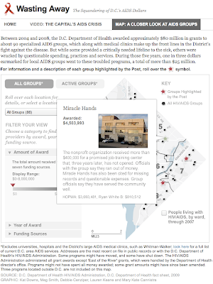
This morning a project went up that I’ve been working on for a while. Debbie Cenziper investigated this really interesting piece on funding for AIDS providers in D.C.
“In a city ravaged by the highest rate of AIDS cases in the nation, the D.C. Health Department paid millions to nonprofit groups that delivered substandard services or failed to account for any work at all, even as sick people searched for care or died waiting.” – Staggering need, striking neglect
Mary Kate Cannistra located the agencies and provided me with a base map, and I built this piece that allows sorting through a slider mechanism and with radio button components. You can isolate agencies based on amount of funding, year of award or type of funding. It allows you to get more information by rolling over agencies or by selecting from a dropdown list, which is updated whenever you change the filters. We’ve also highlighted six providers, for which we’ve added extra information (photo and paragraph description).
The slider is reusable, you just initialize it with the two amounts at either end and the data that needs to update. I think we’ll have a lot of use for that functionality moving forward.
Reusing the classes I’d created saved a lot of time — it only took a few hours to create this piece. With the improvements we could have a 15-minute turnaround on future projects.
Yesterday we launched a multimedia narrative on the Battle of Wanat, one of the deadliest battles that have taken place in Afghanistan since the war began. I designed and developed this timeline in collaboration with Greg Jaffe, Liz Heron, Ben de la Cruz, Laris Karklis and several others.
It combines video, audio, maps, documents and photography to tell the story of what took place on July 13, 2008, when Taliban fighters launched a major assault on a small U.S. Army outpost in Afghanistan, killing nine soldiers and wounding 27. It chronicles the battle from the perspective of a lieutenant killed in the fight, Jonathan Brostrom, and his father, who has been seeking answers to what went wrong.
This graphic was published today, accompanying a story by James Grimaldi about how the Redskins are selling their tickets to brokers. The graphic explores lawsuits filed by the Redskins since 2005 and tickets sold to one broker in 2008. It also shows which tickets they filed lawsuits over and then resold to the broker. The lawsuits are sortable by amount and status, and the tickets are sortable by game.


![[Map image]](http://2.bp.blogspot.com/_1NI9wgirUFw/SucwgpHmSpI/AAAAAAAAAIs/lQwnCpmThN4/s400/Picture+1.png)
![[Politics of the Prize]](http://2.bp.blogspot.com/_1NI9wgirUFw/StC6eqXdCwI/AAAAAAAAAIY/uUAABKBskZc/s400/Picture+1.png)


![[Redskins graphic]](http://3.bp.blogspot.com/_1NI9wgirUFw/Sp83a72OmZI/AAAAAAAAAGQ/gwKjRo2pvaM/s400/Picture+7.png)