Live presentation for 2016 election

Published in The Washington Post, November 2016

US Election results 2016

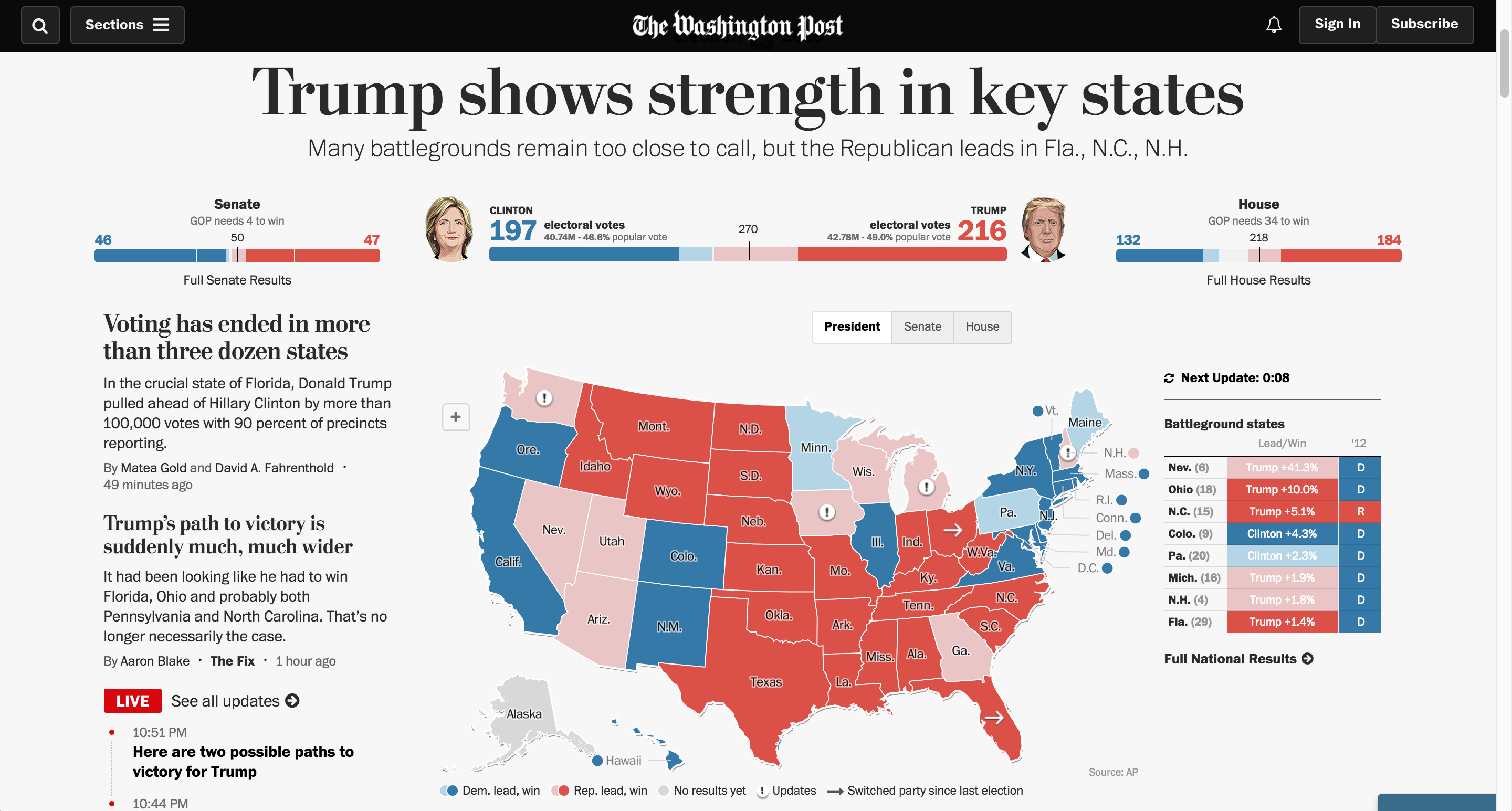
I pitched, developed and managed a partnership with Development Seed to execute the engineering and presentation of results displays for the 2016 election cycle. I was the project lead, working across multiple departments internally and externally to manage contracts, understand and prioritize needs, develop strategy, test and improve the technology and brief stakeholders.

These maps ran across The Washington Post products, including our site and native applications on iOS and Android, and many of our news service client sites.

Role: Editing, project management

My team also created dozens of other fantastic graphics for the election, collected here.

America’s Great Housing Divide

Published in The Washington Post, April 2016

Housing

This series about the recovery of the U.S. housing market was instigated by Ted Mellnik, one of our best data reporters. Emily Badger from the Wonkblog came on board and Darla Cameron explored many kinds of visual approaches. Denise Lu took over for Darla when she went on maternity leave and Madia Brown worked on design of the stories that followed the overview.

screenshot-2016-10-06-06-38-01

For digital audiences, we created a geo-focused story with text customized to your zip code, featuring an interactive map of home value changes over the past decade. For print, we combined the Stockton, Calif., story together with the overview of findings that we had online.

Working with our newsletters editor, we created a very successful email campaign that sent emails to readers from the different cities we covered in the series. I love the clean design, simple and intuitive user interface, clear writing and navigation.

Role: Editing, project management, some design and development.

Awards: Finalist for an OJA for Explanatory Reporting; Finalist for Loeb Award, Explanatory Category

New homicides map

We just launched this interactive map with details about 2,294 homicides that occurred in D.C. between 2000 and 2011. You can find the killings in your neighborhood, follow the trends over time, and learn how the victims died and what happened to their cases.

Key findings featured in the graphic:
Click the headline to jump straight to that view in the map.

Homicides in D.C. are down 55 percent since 2000
The number of homicides in the District fell last year to 108, a 49-year low. Despite the decline, homicide continues to be a tough crime to solve and prosecute in the city.

Motives: Drug killings down 84 percent
The most common motives for homicide in D.C. are arguments, drugs and retaliation. About 2 percent are classified as gang-related. Homicides involving drugs have decreased about 84 percent since 2000. Drug-related homicides accounted for eight of the city’s killings last year, compared with 49 in 2000.

Most dangerous age: 24 percent of those killed were in their early 20s
More than half of the District’s homicide victims between 2000 and 2011 were between the ages of 15 and 29. About 93 percent of those victims were male, and 94 percent were African American.

Mapping the news: Libya and Japan

The past several weeks have been full of foreign news, and we have been producing lots of graphics to explain what’s happening. I have worked on these two graphics, one about the earthquake and subsequent tsunami in Japan, and one that explains what is going on in Libya.

For a full explanation of the process of creating the Japan graphic, visit the new Innovations blog at the WP (excerpted below):

Friday morning, as news of the earthquake in Japan spread, we started pulling together an interactive map that would show readers where and how events unfolded. Over the next 36 hours, we would continually expand and improve the information, design and interactivity of the map as the news of the earthquake and tsunami came in. Read more »

For Libya, we combined an event tracker with audio and video from the ground. The reports from correspondents on the ground is my favorite part.

Both graphics are done using javascript and jquery, so check them out on your tablet devices!

Creating Live Election Results Maps

Live Results: House

On Nov. 2, midterm election day, we put up these maps that tracked the results as they came in. For Senate and Governors we had state and county-level data, and we had House districts as well. This suite of maps was published in The Washington Post, as well as on Yahoo! News and the Telegraph (UK). The maps have balance of power charting and tabular results as well as zooming and deep linking features. Read more about how we built the maps »

Arbor Day Trees Map

We published this graphic for Arbor Day, which was on April 30. It takes a look at all the trees that have been planted by the non-profit organization Casey Trees since 2003. They’ve planted thousands of trees in order to try to increase D.C.’s “urban canopy.” You can use this tool to see where they’ve planted trees in your neighborhood and what kind they are.

Redbud Trees in DC

From a technical standpoint, this project was really interesting. It was executed in about two days, so it was a really quick turnaround, considering I haven’t done extensive development with the google maps api. Nathaniel and Gene worked up some cool custom tiles, and I designed and programmed a lot of it, and fit all the pieces together. Keep reading this post »

2010 Political Race Maps: House, Senate and Governors

2010 Campaign: Congressional Races

These three new race maps (house, senate, and governors) launched today with the new PostPolitics section of The Washington Post. I worked with Karen Yourish and Dan Keating, who are absolutely amazing data whizzes, to get the data together for the project, and Nathaniel Vaughn Kelso gave me some great base maps to start with. We really wanted to give a complete picture of the 2010 races, so we have current race ratings (for house, we have state of the race), election history for each district or state, and demographic information that lets you see some cool patterns — like how states vote when they have a high percentage of seniors or high poverty rates. Keep reading this post »

New county map: Ultra-high Medicare Billing Rates

Billing Medicare at the highest rates

I re-purposed the unemployment map for this story about ultra-high billing rates at skilled nursing facilities in the U.S. It shows where facilities are billing ultra-high rates. The Washington Post found that nursing homes have flooded ‘ultra-high’ billing categories with patients, and the amount of waste and abuse could reach billions of dollars a year. Check out the graphic or read the story by Scott Higham and Dan Keating.

Nationwide County Map

After many months talking about how we wanted to produce a nationwide county map, we finally had a project come up that called for one with a quick turnaroud — one and a half days! With a great base map by Nathaniel Vaughn Kelso, I created this United States county map that shows unemployment from 2007-2009. This is an early version, so there’s a lot of improvements to make, but I think it’s a solid start, and I’m happy we turned it around as fast as we did. I used classes I created for the helicopters state map and the Virginia governor’s race map to make the build much easier.

Unemployment by county

D.C.’s unemployment rate was 12.1% in Oct. 2009 — really high. Macon County, where Franklin is, had an unemployment rate of 10.3%. We’ll keep adding to this map as time goes on, and I think it’ll be really interesting to see what happens with jobs and the economy over time.