This morning a project went up that I’ve been working on for a while. Debbie Cenziper investigated this really interesting piece on funding for AIDS providers in D.C.
“In a city ravaged by the highest rate of AIDS cases in the nation, the D.C. Health Department paid millions to nonprofit groups that delivered substandard services or failed to account for any work at all, even as sick people searched for care or died waiting.” - Staggering need, striking neglect
Whitney Shefte also did this beautiful documentary piece on AIDS in DC, which is really touching and a great overview of what’s happening in the city. For the package, I designed the splash page, the chapterized video player for Whitney’s documentary, and a map of providers in the district.
Map of D.C. Aids Providers
Mary Kate Cannistra located the agencies and provided me with a base map, and I built this piece that allows sorting through a slider mechanism and with radio button components. You can isolate agencies based on amount of funding, year of award or type of funding. It allows you to get more information by rolling over agencies or by selecting from a dropdown list, which is updated whenever you change the filters. We’ve also highlighted six providers, for which we’ve added extra information (photo and paragraph description).
The slider is reusable, you just initialize it with the two amounts at either end and the data that needs to update. I think we’ll have a lot of use for that functionality moving forward.
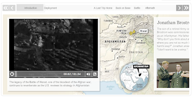
Yesterday we launched a multimedia narrative on the Battle of Wanat, one of the deadliest battles that have taken place in Afghanistan since the war began. I designed and developed this timeline in collaboration with Greg Jaffe, Liz Heron, Ben de la Cruz, Laris Karklis and several others.
It combines video, audio, maps, documents and photography to tell the story of what took place on July 13, 2008, when Taliban fighters launched a major assault on a small U.S. Army outpost in Afghanistan, killing nine soldiers and wounding 27. It chronicles the battle from the perspective of a lieutenant killed in the fight, Jonathan Brostrom, and his father, who has been seeking answers to what went wrong.
I said I was going to publish some of my recent work, so here goes. All of this stuff has been done in the past several months and has been published on washingtonpost.com.
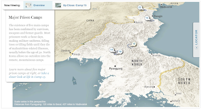
I worked on this interactive graphic about North Korean prison camps last month. It explores the five major camps and goes into detail about camp 15. Laris Karklis did the maps, Blaine Harden wrote the text, and I did the design and build.
In April, I worked with Amanda Zamora and Alexandra Garcia on this panoramic timeline of the scene of the shooting of DeOnte Rawlings. It uses three panoramic images, a map, and multiple hot spots to lead the reader through the sequence of events that led to Rawlings’ death. I used the same technology (Flash Panorama Player’s hotspots plugin) for this as I did for the Skipjack pano piece I posted below, but I think this is a much more sophisticated use of hotspot technology.
In April we also launched the D.C. budget game, which people can use to learn more about the city budget and what programs would stay or go with varying levels of funding. Users can save their budgets and compare their choices with other users.
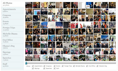
For Barack Obama’s first 100 days, I created this sortable photo gallery that lets readers see exactly what he was doing. Load time is pretty slow, so future iterations will be much leaner.
Scene In: This player for a new series on fashion in D.C. by Alexandra Garcia utilizes the new AS3 video player Jesse Foltz created and features a logo illustration by Noel Smart. I designed the series player and built out the functionality. A new episode comes out every other Thursday.
I was just poking around my old blog posts and realized that this blog is about to turn five years old on June 7. In honor of that milestone, I plan to completely redesign the blog and add some features. I’m also going to be posting some of my more recent work in the next few days/weeks.
I realize my last post was more than a year and a half ago, and a lot has happened in the interim. About a year ago, I started working at washingtonpost.com. I’ve been working on some really interesting projects, focusing primarily on creating interactive graphics, special report pages, and multimedia presentations.
Here are a some examples of multimedia projects I’ve worked on since starting at the Post:
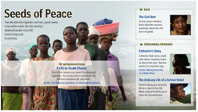
Seeds of Peace: I did this project last July, but I was really happy with the way it turned out. Ben de la Cruz did a wonderful job on these three video stories and a Q&A video, so I had amazing art to work with for the splash page of this piece. A really incredible story of what’s going on in Uganda as civil war continues and people are displaced.
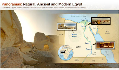
Egypt Panoramas: Post multimedia journalist Alexandra Garcia shot these beautiful panoramas of Egypt on a recent trip. I created this interface, with the pano moving behind the map of Egypt, which also acts as a menu. This project was built totally through XML, so it was really easy to reuse, as we did for the Venice Biennale.
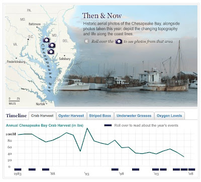
Failing the Chesapeake: This small interactive piece acts as an anchor on the index page of the series. It features a then and now photo piece, a timeline, and several charts showing declining health of the Chesapeake. I also created an interactive panorama from a panorama Whitney Shefte shot of a skipjack, a type of boat used in the Chesapeake.
In the Moment: I did this splash design and set up the video players for this awesome piece the Washingon Post video team did on Barack Obama’s inauguration in January.
Israel Strikes Gaza Strip: During conflict in the Gaza Strip last December, I worked with Sarah Sampsel to create this XML-driven map of Israel that shows attack sites and gives a synopsis of the events as they occurred. We updated this throughout the conflict.
washingtonpost.com
Blood on the Mountain: Also, last summer I worked on this timeline about a murder on the Appalachian Trail. I thought it turned out to be interesting and I like the way the map is incorporated into the timeline. Plus, it’s a fascinating story, which never hurts :-)
washingtonpost.com
And, to top it all off, my very first project at I worked on at the Post: Explore Nationals Park. This project incorporated video, panoramic images and a stadium rendering that we got from the firm that worked on the stadium, HOK Sport. I designed it and put together the dynamic version of some of the graphics, and Nelson Hsu put it all together. It was a great experience to work on something like this when I first arrived and Nelson was a great person to learn from.
washingtonpost.com
I also plan to (finally) post some pictures from India and some stories about the trip.
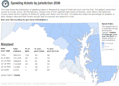
SPEEDING TICKETS BY JURISDICTION 2006 This map shows the distribution of speeding tickets in Maryland by range of miles-per-hour over the limit. The pattern varies county-by-county.
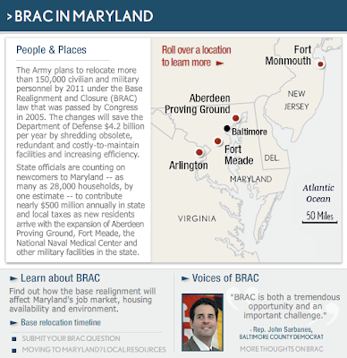
BRAC SECTION FRONT In preparation for the influx of military workers coming to Maryland during the upcoming base realignment, we wanted to prepare a page that explained the process, informed readers of current developments and provided resources for those moving to the area. I designed the BRAC page and the flash graphic in the center of the page, which includes a map of affected bases, quotes from area officials and a timeline of BRAC events. I used archived articles to write all the text for the map portion.
FEATURED COVERAGE SECTION FRONT A section for special coverage was created during a site redesign in the summer of 2007 and I was assigned to create a page that incorporated unique, compelling stories, in-depth and continuous coverage, multimedia, including photography, audio and interactive, and regular features.
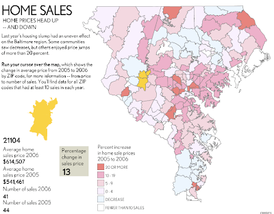
HOME SALES MAP Using home sales data compiled by a real estate reporter, I created one of two maps that analyzed year-over-year price changes by zip code.
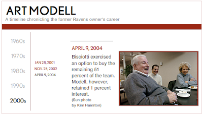
TIMELINE: ART MODELL This timeline about the life of Art Modell was created to top a gallery of stories about the former Ravens owner. It was one of several timelines that were created using a timeline template that I created in Flash.
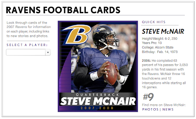
RAVENS FOOTBALL CARDS I designed this new take on traditional football cards as a fun way to let Ravens fans check up on their favorite players.
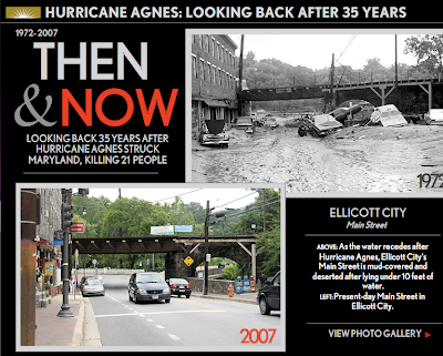
HURRICANE AGNES: 35 YEARS LATER In preparation for hurricane season, I suggested a retrospective about the impact of past hurricanes in Maryland. My supervisor suggested an anniversary piece about Hurricane Agnes. The photo desk provided archived photos and I went to Ellicott City to photograph locations that were seen in the archived images. Then I created this piece about the event.
ORIOLES OPENING DAY VIDEO I shot and edited this video about fans attending the season opener at Camden Yards.
Today there are two items on the agenda. #1 - The magic of the Internet and #2 - The question of whether or not the Facebook has gone too far.
#1: The Magic Today I went to check out Katie Couric’s first broadcast on YouTube, when I was distracted by a video called “Piano Tetris”, which led me to the video I have posted below. The video is by a person named “cutiemish”, who pronounces some words to show her accent. But the really amazing part of the broadcast is the request for others to send back videos with their own accents so she can hear them. There are several replies from various countries including The Netherlands, Canada, US, Australia, Sweden, and France. For me, this is absolutely amazing! People are so into YouTube that they will make a small video just to show something simple like how they pronounce words! And I have to admit that I watched them all and was delighted by the accents :) Just another sign that the internet is changing our lives in a subtle yet powerful way.
#2: Has Facebook gone too far? And I believe the answer is yes. Several Facebook groups have arisen with the introduction of the Facebook’s new feature, “News”. I mentioned it yesterday but I don’t feel that I did it justice given the outrage that the Facebook is currently experiencing. The anti-news groups have names like “Facebook has Crossed the Line” and “Students Against Facebook News Feed (Official Petition to Facebook)”-yet, there are groups that are pro-news: “If you joined the petition, you don’t know about information architecture”-which argues that the Facebook gave you all the “news” to begin with but it was much harder to access (and we all accessed it anyway).
For those of you who may not be on the Facebook, a brief intro might be helpful. The Facebook is a networking site that originally was open to college students. It then expanded (quickly) to include high schools, cities, and now, workplaces. The last two networks are by invite only, unless you are already on the Facebook. The Facebook has capabilities for profiles, photo albums, bulletin boards, party invites, groups, messaging, blogging, and now- NEWS. In fact, I bet a lot of people are reading this post through the Facebook right now…
The “News” item basically changed the personalized home page to include news about all your friends. The news includes profile changes (i.e. Charles changed his interests to include streaking), new photos, new “notes” (or blog posts), group membership changes, pretty much anything and everything.
The real question here is how much do we want our friends to know? That we posted new pics? Yeah, sure they can know that. New interests? OK. That you posted “I’ve got a bottle of vodka down my pants” on Tina’s wall? I don’t think so. And so begins the protest. The thing is that the Facebook is already out there.. really curious friends (or stalkers, as some call them) could find what they were looking for anyway. It’s the normal friends we’re all worried about.. the people you haven’t seen in five years who never read your profile anyway or the guy you just met on the metro who oddly Facebooked you.. and you’ll never talk to or see again. I mean, I don’t want everyone knowing everything about me. Actually it kind of freaks me out that my blog is on Facebook — but I guess it drives traffic.
But that is the nature of the beast. Just like your friends can read all about you, so they say employers can too. A New York Times article from June tells about how employers use networking sites to screen employees. That is a little scary, because most of us (including me) have the obligatory drinking/smoking/dancing pictures posted somewhere online.. and some with not-so-appropriate comments from friends-which I love, but somehow I think that it wouldn’t help me get the job. I notice my friends taking their questionable groups (ones like “Vodka Makes the Party Start”) off their profiles, and taking any pictures that might include the aforementioned college behavior, just in case somebody (an employer? a new facebook friend from the office?) might see it.
Well I’ve made a decision about life on the internet, which is that it’s a little bit of professional and personal. Some people get the extended profile, and some people get the limited profile. And in my opinion, that’s just like life, where my real friends get the good stuff and my sort-of friends get some laughs and some fun. And so, I guess I am against the Facebook news feed.. because if you care enough to search it out, you deserve it. And let all the people who don’t want to know and who don’t care just keep moving on with their lives.
PS. Comments are welcome (on Blogger) because I’m not really sure if anyone is reading this.
 It combines video, audio, maps, documents and photography to tell the story of what took place on July 13, 2008, when Taliban fighters launched a major assault on a small U.S. Army outpost in Afghanistan, killing nine soldiers and wounding 27. It chronicles the battle from the perspective of a lieutenant killed in the fight, Jonathan Brostrom, and his father, who has been seeking answers to what went wrong.
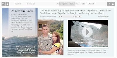


![[Scene In]](../../../_1NI9wgirUFw/Sp86PuFr9MI/AAAAAAAAAGY/vcjW3tiNkTY/s400/Picture-1.png)
![[In the Moment]](../../../_1NI9wgirUFw/Spp6yKwuoFI/AAAAAAAAAE0/1fE5fVHmbWw/s400/in-the-moment.jpg)