Excerpts from a new post for WP’s @innovations blog:
[Go to the blog to read the whole thing]
When Apple announced early last year that it would not support Flash on the iPhone and iPad, a passionate conversation erupted in the world of web development: Was Flash dead? If not, how would it survive? When should it be used? News developers asked these questions as well, and, at least in our newsroom, the conversation inspired some thinking about how to approach interactive development. Over the past year and a half, there has been steady movement toward more interactivity based on JavaScript and fewer Flash-only experiences.

Last week we published a graphic that compared four federal budget proposals through a series of charts. We used the jQuery library Flot to draw simple, interactive line charts that showed how the debt and deficit would change under the different plans. Flot is very easy to use, flexible and customizable, and is one of many free-to-use JavaScript graphing libraries out there (Dracula, Highcharts and RGraph are a few others). We also built a customized chart with CSS and JavaScript at the bottom of the page to show how different categories of spending would be affected.
Read the rest of the article…
Kat Downs
June 2, 2011
Programmingarticles, Design and infographics, Flash, graphics, interactive, javascript, programming, technology, washingtonpost.com, Work, writing
Read more >
A multimedia history of the 9:30 club
I spent the last few days working on this piece about the 30th anniversary of the opening of the 9:30 club, one of the best venues in D.C. (and a lot of people would say the whole country). Alex Garcia shot some great concert video and interviewed some key people, and Josh du Lac wrote the magazine story. I pulled it all together in this multimedia slideshow, which has several different text layouts and video in varying sizes. The content of this is the coolest part — there are some great stories in there about the old club: how there were so many rats they had something called the “rat highway,” how Will Smith (The Fresh Prince) showed up and just left without playing the show because he was so disgusted at how the place looked and smelled, and a whole bunch more. There are also some great photos from the ’80s and ’90s. I pulled the illustrations from the magazine layout, which you can see here.
Kat Downs
April 16, 2010
MultimediaAlex Garcia, Design and infographics, Flash, Multimedia, Photography and multimedia, The Washington Post, video, Work
Read more >
I worked on this graphic with reporters Josh White and Maria Glod, who collected an incredible amount of information on the East Coast Rapist, a man who has been on the loose for 13 years and is a suspect in 17 cases. For this important story, I organized the data that Josh and Maria collected into an easy-to-use interface that had the details of each case, including a small photo gallery, a google map, a quote and all the case information. I built an interface that drew connections between the cases and allowed people to sort the cases by date, location, existence of dna samples, and the weapon used. It also featured a map interface, a gallery and a video. Keep reading this post »
Kat Downs
March 22, 2010
Information Graphics, Multimediacrime, Design and infographics, Flash, graphics, Information Graphics, josh white, maria glod, The Washington Post, video, Work
Read more >
A full year after Whitney and my trip to India, we finally finished up the piece we were working on for it: India in Motion, which was published on The Washington Post’s website. Whitney did over 20 short videos reflecting the sights and sounds of the country.
There are videos from almost all the places we visited, chief among them Mumbai, Udaipur and Rishikesh. I designed the piece and built the player, which had some similarities to Scene In in that it was a series player and I used some of the same code, but look and feel wise, it is pretty different. Keep reading this post »
Kat Downs
February 28, 2010
MultimediaDesign and infographics, Flash, India, Multimedia, The Washington Post, Travel, video, Whitney Shefte, Work
Read more >
I worked on two graphics for the recent election in Virginia — a map that shows the results of the 2009 governor’s race and election results back to ’97, and a delegates meter showing the balance of power in the VA House of Delegates.
VA Election: Live Results
The governor map showed live results throughout the night, and at the end of the night historical results showed up as well, so that users could look at how voting patterns have shifted since previous elections. I think this was really interesting given the speculation about how the 2008 presidential election might impact this year’s race in Virginia.
VA Elections: Historical Voting Shifts
The delegates meter was a quick piece, I just used some circle drawing math in AS3 to create 100 segments in a half-circle, and fill them in as the results came in. When you roll over the segments, you see current results for that district.
VA Elections; Delegates Meter
I made small versions of these graphics to go on our local homepage on Tuesday night and Wednesday morning. They were simplified versions that linked out to the full graphics. I think that was a smart way to push traffic to our graphics on election night, while giving casual viewers a current tally of results.
Kat Downs
November 24, 2009
Information Graphics, Workelections, Flash, graphics, Information Graphics, local, Maps, politics, The Washington Post, Work
Read more >
This graphic looks at demographic changes in Virginia for the past 10 years. You can select a category to see demographics on the map, and roll over each county for details. This map reuses functionality I built out for the campaign finance map earlier this year. We’ll get a lot of use out of this map of Virginia in the future.
![[Map image]](../../../_1NI9wgirUFw/SucwgpHmSpI/AAAAAAAAAIs/lQwnCpmThN4/s400/Picture-1.png)
A state of change
Kat Downs
October 27, 2009
Maps, Workdemographics, Flash, Information Graphics, local, Maps, The Washington Post
Read more >
I created this graphic about controversial winners in Nobel Peace Prize history based off of some of the development work I’d done for the helicopters project. The timeline and slideshow componenets are very similar, I just switched the look of the slideshow portion and made the timeline interact with the slideshow.
![[Politics of the Prize]](../../../_1NI9wgirUFw/StC6eqXdCwI/AAAAAAAAAIY/uUAABKBskZc/s400/Picture-1.png)
Timeline: Politics of the Prize
Reusing the classes I’d created saved a lot of time — it only took a few hours to create this piece. With the improvements we could have a 15-minute turnaround on future projects.
Kat Downs
October 10, 2009
Design and infographics, WorkFlash, Information Graphics, Karen Yourish, The Washington Post, timeline
Read more >
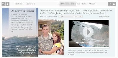
Yesterday we launched a multimedia narrative on the Battle of Wanat, one of the deadliest battles that have taken place in Afghanistan since the war began. I designed and developed this timeline in collaboration with Greg Jaffe, Liz Heron, Ben de la Cruz, Laris Karklis and several others.
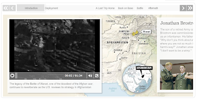 It combines video, audio, maps, documents and photography to tell the story of what took place on July 13, 2008, when Taliban fighters launched a major assault on a small U.S. Army outpost in Afghanistan, killing nine soldiers and wounding 27. It chronicles the battle from the perspective of a lieutenant killed in the fight, Jonathan Brostrom, and his father, who has been seeking answers to what went wrong.
Kat Downs
October 5, 2009
Multimedia, Workaudio, Ben de la Cruz, Flash, Information Graphics, Laris Karklis, Multimedia, The Washington Post, Videos, Work
Read more >