Projects
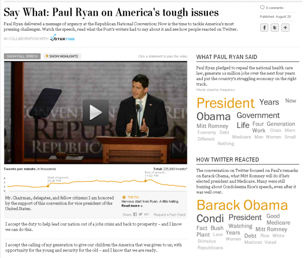
Yesterday, we launched a new project: an interactive transcript player that matches up the words of the speech, Post analysis, and reaction from Twitter.
I have been wanting to do a Twitter project for a while, and this time all the pieces fit together. After I pitched the idea, Cory Haik coordinated a partnership with VoterTide, a great company in Omaha that does aggregation and analysis of Twitter trends specifically around politics, that made the Twitter analysis segment possible. I designed the piece, and we were able to get two awesome developers, Leslie Passante and Jeremy Bowers, to build it.
My favorite things are the ‘watch highlights’ view, where you can see all the Post analysis and skip everything else, and the addition of the social layer. Here’s an excerpt from the ‘Ask the Post’ blog post we put together on it:
… VoterTide will provide user reactions as they happen on Twitter, and we’ll match that to the moment in time these reactions occurred during the speech. We will package these reactions to reveal insights into the nation’s response to the conventions and their most-watched speeches.
We’ve gotten some great reaction from this project on washingtonpost.com and on Twitter. It was also written up by Poynter:
So as the GOP nominee took to the podium and the president prepares to do the same at next week’s DNC, it is appropriate that journalists roll out the coolest newest thing. The Washington Post did just that.
“Some innovations we have done, you step back and say, ‘That was fun.’ And some you might say, ‘We produced a new story form.’ But this time I think we can say both,” Haik said.
Totally agree! And we just did another one for Mitt Romney’s speech. This project would not be possible without the awesome producers who put it together: Haley Crum and Mary Keister. Check it out!
Tags: coryhaik, Design and infographics, development, haley crum, interactive, jeremy bowers, leslie passante, mary keister, projects, social, The Washington Post, video, washingtonpost.com, Work
Information Graphics, Multimedia
Here’s some of what the WaPo team put together for the London Olympics:
The definition of perfection
I designed this piece about how gymnastics scoring worked. Wilson Andrews developed it and edited/animated the videos, and Bonnie Berkowitz did the writing.

Profiles in Speed
This six-part series we developed in the run-up to the Olympics featured greats like Missy Franklin, Michael Phelps and Carmelita Jeter. Videos, infographics, and awesome articles. I especially love the segment on technology.

Are you over the hill for Olympic sports?
As part of the Profiles in Speed series, I developed this graphic which lets you see where you fit into the Olympic age spectrum. Flowing Data wrote about it here.

Four more pieces after the jump! »
Tags: alberto cuadra, bonnie berkowitz, Design and infographics, fun, graphics, interactive, katie park, olympics, sisi wei, sohail al-jamea, sports, washingtonpost.com, wilson andrews, Work
Multimedia, Work
I’ve been completely delinquent about posting here. I will try to do better, and in the meantime, here is a selection of work from the first part of the year (am going to follow this up with some breakout posts on specific projects).
What’s at stake on Super Tuesday?
Going way back to Super Tuesday, we published this really fun motion graphic featuring Chris Cillizza and the delegate mountain that Todd Lindeman and Sisi Wei built. I worked on storyboarding it with the team, a well as helping in the studio (led by AJ Chavar and Sohail Al-Jamea) and with building out the page. The project was really fun and newsy, and a great job especially by animator Sohail, and of course Chris Cillizza.

Rescue and Recovery
This is a really powerful piece looking at Virginia Tech five years after the massacre, through the lens of an iconic image of survivor Kevin Sterne. I did design, development, audio and wrote one of the segments of the piece. I love the simplicity and amazing story. Again, an awesome team effort with work from Ben de la Cruz, Bill O’Leary, Josh du Lac and others:

Repairing the Washington Monument
This piece about the damage to the national icon just came out last week — featuring a 3-D model by Alberto Cuadra, and reporting by Cristina Rivero. Kathryn Faulkner, the summer intern in graphics, did most of the heavy lifting on the interactive side, with me in an editing role and pitching in to help with some of the tricky parts, like the rotating model. The piece turned out beautifully:

Tags: albertocuadra, bendelacruz, dc, Design and infographics, infographics, Information Graphics, interactive, Karen Yourish, kathrynfaulkner, politics, sohailaljamea, vatech, washingtonpost.com, workw
Information Graphics, Travel, Work
I just got back from the NICAR conference in St. Louis, where I gave a talk with Bill Keaggy on Best Visualization Practices. There’s delicious stack of links here: http://bit.ly/nicar2012 and the presentation is here (click the settings gear and open speaker notes to find out what we talked about):
Chrys Wu kept a detailed list of links if you want to check out some of the other sessions. I also got the see the St. Louis arch! Very exciting:
Tags: charts, Design and infographics, missouri, nicar, presentations, st. louis, Travel
Multimedia, Work
It’s been a busy few months, but I’m gonna squeeze in a post for January! I’ve switched jobs at the Post and moved into a new role, Interactive Projects Editor, focusing on creating interactive projects that combine design and graphics with video, photography and social media. I’m really looking forward to the new challenge. In other news, I’m getting used to the new delicious and trying out this ‘stacks’ thing. I’ve got a few going, namely one on interactive maps and one for games and quizzes. I’ll keep those updated as I collect links around the web. And, some of my recent work….
Pinocchio tracker
The tracker part of this was originally done with Tableau, but we decided to rework it and to add a game element to it. It’s on a page of its own as well as in the right rail on all our politics content. Try it out!
The Media Divide
This piece was born from a project by Marc Fisher to track what media people consume in a day and see how it reflects their ideology. Evelio Contreras did this great video and we put it together in a calendar with links to all the news they watched/read/listened to, and combined that with a poll.
The Seat Pleasant 59
This project leads with Whitney Shefte’s awesome video about a class of students who were promised that if they graduated from high school, their college would be paid for. We tracked down the students and found out where they are now. My contribution was the list/grid view and filtering along with itemizing content for each of the dreamers.
Tags: amanda zamora, delicious, Design and infographics, evelio contreras, factcheck, game, graphics, interactive, jobs, links, local, marc fisher, Multimedia, politics, poll, userdata, video, washingtonpost.com, Whitney Shefte, Work
Projects
An excerpt of my post about our new project on the WP innovations blog:
This is one of the first projects to take users opinions and mash them up with actual data to see whether perceptions match up with reality. It’s a fascinating window into how people feel about the places where they live and a forum for a conversation around how things are changing.
There are already some patterns emerging. We are starting to see that, in general, more states with high unemployment are being rated ‘worse’ by users, and more places with low unemployment are being rated ‘better’.
D.C. stands out – though unemployment is high, 83 percent of users (as of publication of this post) ranked it better. One left a comment after rating it ‘better’: “DC is better due to a higher number of permanent residents, community activism, and better stewardship. Welcome to the 21st century!” The comments on why people voted the way they did have been some of the most interesting results of the project we’ve seen so far.
Read more of this post at @innovations »
Tags: census, dankeating, Design and infographics, infographics, ugc, unemployment, usergeneratedgraphics, washingtonpost.com, Work
Information Graphics
In an extremely quick turnaround, I worked with Dan Keating to create this tool that shows you the breakdown of what other people of your age, race, and location make each year. Hopefully in the future we’ll be able to improve it and add some more metrics, but it’s pretty cool for taking less than a day!
Tags: acs, census, charts, Dan Keating, data, income, infographics, The Washington Post
Information Graphics
To create this graphic about exercises you can do at the office, the entire graphics department of the Post got together twice a day to do the exercises. It was a hilarious group activity — we attracted a lot of stares from passersby in the newsroom. I really enjoyed jumping around a little bit in the middle of the day to get the blood pumping.
The graphic was a fun collaboration between Laura Stanton, who illustrated many of the department members, Sohail Al-Jamea, who created the animations, Bonnie Berkowitz, who was our exercise leader and researched and wrote all the text and conducted the survey, and me — I helped design and build the interactive and set up the videos and polls.
So far we have had a lot of people voting — about 1,700 for the first exercise. It’s fun to see how people have responded to each exercise, and we’re hoping it is promoting engagement with the piece.
Tags: exercise, games, health, illustration, interactive, laura stanton, Multimedia, polls, sohail al-jamea, video, voting