Global Warning

A full five months after wrapping the Global Warning project, I think it’s time to do a blog post about it! I spent last fall working with a team of students on a National Security Reporting project at Northwestern University’s Medill School of Journalism. I was an adjunct professor, teaching the students multimedia design and light programming, and serving as the design lead for the project, which was led by Ellen Shearer and Josh Meyer.

After spending a couple of months in the discovery and ideas phases, we decided on several graphics that would address the main topic of the project: How could climate change affect national security?
Read more…

Campaign 2010 Race Maps

Published in The Washington Post, The Telegraph (UK), and Yahoo News, 2010

Campaign 2010 Race Maps

Role: Design, programming

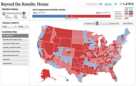
I created these three race maps (house, senate, and governors) to correlate with the redesign of PostPolitics. I also created a live results map for election night. We really wanted to give a complete picture of the 2010 races, so we have current race ratings (except for the House, where we have state of the race), election history, and demographics that let you see some cool patterns — like how states vote when they have a high percentage of seniors or high poverty rates. Favorite features: really cool zoom functionality, which I explain in my blog, and a slider that shows historical results.

Tools used: Flash/ActionScript 3.0

Awards: Bronze, Malofiej 19

More Flash maps: Unemployment by County (read my blog post), A closer look at AIDS groups, Life expectancy across the U.S.

Memories of MLK

Published in The Washington Post, Aug. 24, 2011

Role: Design, programming

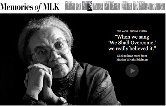
I heard that Nikki Kahn and Megan Rossman had been out shooting interviews with civil rights leaders in advance of the unveiling of the Martin Luther King Jr. memorial in D.C., and I approached them with the idea of doing a presentation that combined photography and videos and used the memories of those interviewed to tell the story of King’s life. I organized the memories so that they flowed through stages of King’s life and built up to the building of the memorial. I wanted to let the beautiful photos and powerful video quotes shine, so I went with a simple, clean interface that used strong pull quotes to draw people into the story. I really like the elegant navigation and the ability to share each story.

Tools used: JavaScript, jQuery, CSS, OmniPlayer API

Related: Interactive memorial with Photosynth

i voted

Published in The Washington Post, Nov. 6, 2012

Role: Design, programming

This user-centered project launched on election day 2012. We asked people why they voted, created a customized button for them, then added that button into visualizations based on candidate, geography and topic. I developed the concept for the piece, designed the desktop and mobile applications, and built the mobile application — check it out on your phone! We got over 35,000 submissions.

Tools used: JavaScript, Bootstrap, d3, CSS

rescue and recovery

Published in The Washington Post, April 15, 2012

Role: Design, programming, reporting, audio

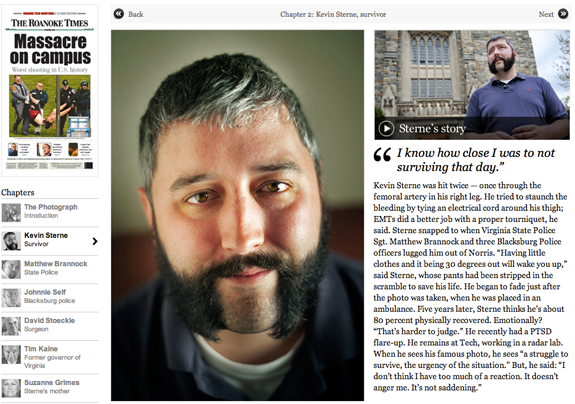
This is a really powerful piece looking at Virginia Tech five years after the massacre, through the lens of an iconic image of survivor Kevin Sterne. I did design, development, audio and wrote one of the segments of the piece. I love the simplicity and amazing story. Again, an awesome team effort with work from Ben de la Cruz, Bill O’Leary, Josh du Lac and others.

Tools used: JavaScript, CSS

Top-secret connections

Published in The Washington Post, July 19, 2010

Top-secret connections

Role: Design, programming

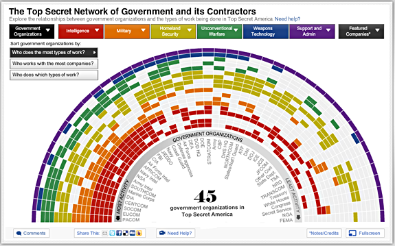
This graphic visualizes the redundancy and relationships in Top Secret America. Specifically, it shows which government organizations do what types of top-secret work, and how many companies they work with. The centerpiece is the color-wheel, which allows users to sort the government organizations in three different ways. It also has individual views of each government organization, work type, and a couple dozen companies. It is all dynamically drawn, fullscreen capable, and utilizes deep linking. For a more complete description, visit my blog. I also helped Nathaniel Kelso with the map for the project, particularly some of the design work and the motion graphics, which I blogged about here.

Tools used: Flash/ActionScript 3.0, Adobe Illustrator, JavaScript, After Effects, Google Maps API

Awards: WHNPA Eyes of History 2011: 2nd Place for Multimedia Package (In-Depth) , 2010 George Polk Award in Journalism (Category: National Reporting), SXSW Finalist for Technical Achievement, Goldsmith Prize for Investigative Reporting Finalist

In the news: Fast Company infographic of the day, Infosthetics: Visualizing the National Security Buildup

Mapping the news: Libya and Japan

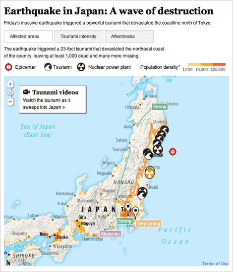
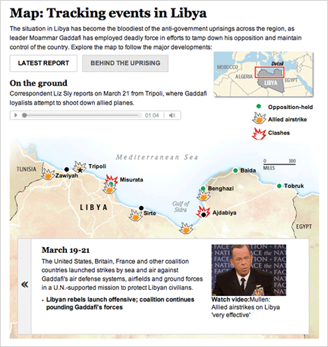
The past several weeks have been full of foreign news, and we have been producing lots of graphics to explain what’s happening. I have worked on these two graphics, one about the earthquake and subsequent tsunami in Japan, and one that explains what is going on in Libya.

For a full explanation of the process of creating the Japan graphic, visit the new Innovations blog at the WP (excerpted below):

Friday morning, as news of the earthquake in Japan spread, we started pulling together an interactive map that would show readers where and how events unfolded. Over the next 36 hours, we would continually expand and improve the information, design and interactivity of the map as the news of the earthquake and tsunami came in. Read more »

For Libya, we combined an event tracker with audio and video from the ground. The reports from correspondents on the ground is my favorite part.

Both graphics are done using javascript and jquery, so check them out on your tablet devices!