Published in The Washington Post, The Telegraph (UK), and Yahoo News, 2010
Role: Design, programming
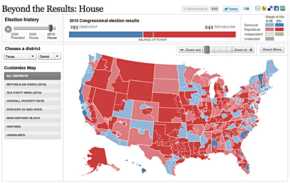
I created these three race maps (house, senate, and governors) to correlate with the redesign of PostPolitics. I also created a live results map for election night. We really wanted to give a complete picture of the 2010 races, so we have current race ratings (except for the House, where we have state of the race), election history, and demographics that let you see some cool patterns — like how states vote when they have a high percentage of seniors or high poverty rates. Favorite features: really cool zoom functionality, which I explain in my blog, and a slider that shows historical results.
Tools used: Flash/ActionScript 3.0
Awards: Bronze, Malofiej 19
More Flash maps: Unemployment by County (read my blog post), A closer look at AIDS groups, Life expectancy across the U.S.
