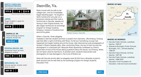
Path of a predator

Timeline of Kevin Ricks' teaching career

After a long week & weekend of wrapping up the Top Secret America project, we hit the ground running with a project that came out today about local teacher Kevin Ricks. A four-month Washington Post investigation of his career revealed a pattern of abuse that goes back to at least 1978 and has a trail of victims that spans the globe. Reporters Josh White, Jennifer Buske, Michael Chandler and Blaine Harden worked on the story, which was just a great piece of reporting. Go read it!

The timeline tells the story through each place Ricks has been, including maps and a list of schools where he worked in each place. It also has audio clips from a hearing where a German student tried unsuccessfully to get a restraining order against Ricks, and myspace messages that Ricks wrote.

This graphic was done using jQuery and CSS. It uses the ColorBox jQuery plugin for the lightbox effect. The audio players are the only Flash pieces in the project — they’re standard across the site (I built them about a year ago). So check it out on your iPad 🙂
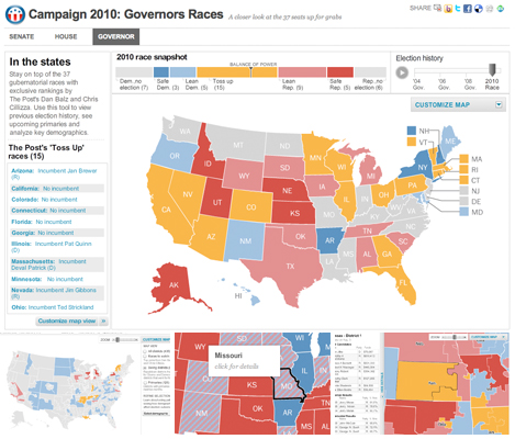
2010 Political Race Maps: House, Senate and Governors

2010 Campaign: Congressional Races

These three new race maps (house, senate, and governors) launched today with the new PostPolitics section of The Washington Post. I worked with Karen Yourish and Dan Keating, who are absolutely amazing data whizzes, to get the data together for the project, and Nathaniel Vaughn Kelso gave me some great base maps to start with. We really wanted to give a complete picture of the 2010 races, so we have current race ratings (for house, we have state of the race), election history for each district or state, and demographic information that lets you see some cool patterns — like how states vote when they have a high percentage of seniors or high poverty rates. Keep reading this post »

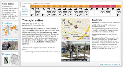
New project: Graphic explains the search for a serial rapist

Rapist's trail spans four states, 13 years

I worked on this graphic with reporters Josh White and Maria Glod, who collected an incredible amount of information on the East Coast Rapist, a man who has been on the loose for 13 years and is a suspect in 17 cases. For this important story, I organized the data that Josh and Maria collected into an easy-to-use interface that had the details of each case, including a small photo gallery, a google map, a quote and all the case information. I built an interface that drew connections between the cases and allowed people to sort the cases by date, location, existence of dna samples, and the weapon used. It also featured a map interface, a gallery and a video. Keep reading this post »

Recent projects: Remembering the decade and new timeline template

It’s been a little while since I updated the blog, so here are a couple of projects from the past month and a half that I think are pretty cool.

The first is a look back at the aughts that I worked on with Joel Achenbach, which was great because I’ve always admired his work and thought he was hilarious. I designed and build a fairly simple panel graphic that has collages of some major things that happened in the 2000s and will impact our memory of the decade. I think it ended up looking pretty cool and it was a fun look back…

Remembering the decade (washingtonpost.com)

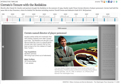
At the end of December I spent a few days working on a new timeline template for washingtonpost.com. I created a new template that improved upon the navigation of our old timeline and allowed more flexibility in text and photo sizing, as well as automatic point placement and the use of points in time and ranges of time.

Cerrato Timeline (washingtonpost.com)

We’ve already used the template for several timelines, including the Cerrato timeline above, a look at women in political history, surge strategy timeline, and a look at Virginia inauguration history.

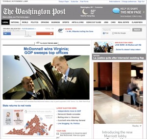
Virginia Election Coverage

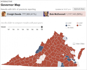
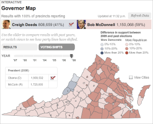
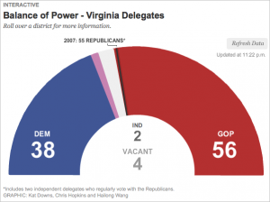
I worked on two graphics for the recent election in Virginia — a map that shows the results of the 2009 governor’s race and election results back to ’97, and a delegates meter showing the balance of power in the VA House of Delegates.

VA Election: Results Map
VA Election: Live Results

The governor map showed live results throughout the night, and at the end of the night historical results showed up as well, so that users could look at how voting patterns have shifted since previous elections. I think this was really interesting given the speculation about how the 2008 presidential election might impact this year’s race in Virginia.

VA Elections: Historical Data
VA Elections: Historical Voting Shifts

The delegates meter was a quick piece, I just used some circle drawing math in AS3 to create 100 segments in a half-circle, and fill them in as the results came in. When you roll over the segments, you see current results for that district.

VA Elections; Delegates Meter

I made small versions of these graphics to go on our local homepage on Tuesday night and Wednesday morning. They were simplified versions that linked out to the full graphics. I think that was a smart way to push traffic to our graphics on election night, while giving  casual viewers a current tally of results.

VA Election: Local HP

New Graphic: Redskins Lawsuits, Tickets

This graphic was published today, accompanying a story by James Grimaldi about how the Redskins are selling their tickets to brokers. The graphic explores lawsuits filed by the Redskins since 2005 and tickets sold to one broker in 2008. It also shows which tickets they filed lawsuits over and then resold to the broker. The lawsuits are sortable by amount and status, and the tickets are sortable by game.

[Redskins graphic]

New Series: Fatal Flights

Last Friday The Washington Post published an investigative series, “Fatal Flights,” on medical helicopters in the U.S.

I worked on three graphics for the piece: two for the first day and one that ran Sunday. The first piece, Fatal Crashes Since 1980, combined a timeline, trend data and crash and victim information for all fatal crashes since 1980.


We also put together this timeline of the 2008 Maryland crash that uses audio and maps to piece together what happened during the search for Trooper 2.


I also created this simple state-by-state map that incorporates filters for different data points. The map shows how helicopters are concentrated throughout the states and how helicopter numbers relate to medicare population and trips.

Recent Design and Development Work

I said I was going to publish some of my recent work, so here goes. All of this stuff has been done in the past several months and has been published on washingtonpost.com.

I worked on this interactive graphic about North Korean prison camps last month. It explores the five major camps and goes into detail about camp 15. Laris Karklis did the maps, Blaine Harden wrote the text, and I did the design and build.

In April, I worked with Amanda Zamora and Alexandra Garcia on this panoramic timeline of the scene of the shooting of DeOnte Rawlings. It uses three panoramic images, a map, and multiple hot spots to lead the reader through the sequence of events that led to Rawlings’ death. I used the same technology (Flash Panorama Player’s hotspots plugin) for this as I did for the Skipjack pano piece I posted below, but I think this is a much more sophisticated use of hotspot technology.

In April we also launched the D.C. budget game, which people can use to learn more about the city budget and what programs would stay or go with varying levels of funding. Users can save their budgets and compare their choices with other users.

For Barack Obama’s first 100 days, I created this sortable photo gallery that lets readers see exactly what he was doing. Load time is pretty slow, so future iterations will be much leaner.


Scene In: This player for a new series on fashion in D.C. by Alexandra Garcia utilizes the new AS3 video player Jesse Foltz created and features a logo illustration by Noel Smart. I designed the series player and built out the functionality. A new episode comes out every other Thursday.

[Scene In]

Work from baltimoresun.com

SPEEDING TICKETS BY JURISDICTION 2006
This map shows the distribution of speeding tickets in Maryland by range of miles-per-hour over the limit. The pattern varies county-by-county.


BRAC SECTION FRONT
In preparation for the influx of military workers coming to Maryland during the upcoming base realignment, we wanted to prepare a page that explained the process, informed readers of current developments and provided resources for those moving to the area. I designed the BRAC page and the flash graphic in the center of the page, which includes a map of affected bases, quotes from area officials and a timeline of BRAC events. I used archived articles to write all the text for the map portion.


FEATURED COVERAGE SECTION FRONT
A section for special coverage was created during a site redesign in the summer of 2007 and I was assigned to create a page that incorporated unique, compelling stories, in-depth and continuous coverage, multimedia, including photography, audio and interactive, and regular features.


HOME SALES MAP
Using home sales data compiled by a real estate reporter, I created one of two maps that analyzed year-over-year price changes by zip code.


TIMELINE: ART MODELL
This timeline about the life of Art Modell was created to top a gallery of stories about the former Ravens owner. It was one of several timelines that were created using a timeline template that I created in Flash.

Modell Timeline
RAVENS FOOTBALL CARDS
I designed this new take on traditional football cards as a fun way to let Ravens fans check up on their favorite players.

Ravens Cards

HURRICANE AGNES: 35 YEARS LATER
In preparation for hurricane season, I suggested a retrospective about the impact of past hurricanes in Maryland. My supervisor suggested an anniversary piece about Hurricane Agnes. The photo desk provided archived photos and I went to Ellicott City to photograph locations that were seen in the archived images. Then I created this piece about the event.


ORIOLES OPENING DAY VIDEO
I shot and edited this video about fans attending the season opener at Camden Yards.