New year, new post

It’s been a busy few months, but I’m gonna squeeze in a post for January! I’ve switched jobs at the Post and moved into a new role, Interactive Projects Editor, focusing on creating interactive projects that combine design and graphics with video, photography and social media. I’m really looking forward to the new challenge. In other news, I’m getting used to the new delicious and trying out this ‘stacks’ thing. I’ve got a few going, namely one on interactive maps and one for games and quizzes. I’ll keep those updated as I collect links around the web. And, some of my recent work….

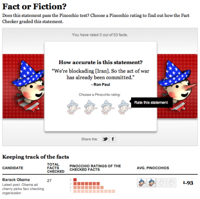
Pinocchio tracker
The tracker part of this was originally done with Tableau, but we decided to rework it and to add a game element to it. It’s on a page of its own as well as in the right rail on all our politics content. Try it out!

The Media Divide
This piece was born from a project by Marc Fisher to track what media people consume in a day and see how it reflects their ideology. Evelio Contreras did this great video and we put it together in a calendar with links to all the news they watched/read/listened to, and combined that with a poll.

The Seat Pleasant 59
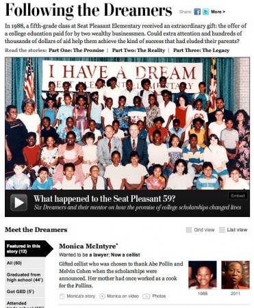
This project leads with Whitney Shefte’s awesome video about a class of students who were promised that if they graduated from high school, their college would be paid for. We tracked down the students and found out where they are now. My contribution was the list/grid view and filtering along with itemizing content for each of the dreamers.

Path of a predator

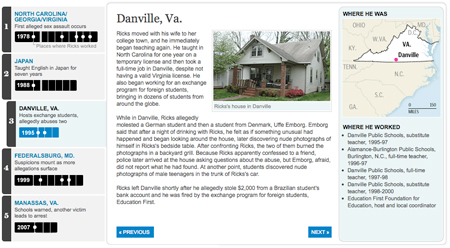
Timeline of Kevin Ricks' teaching career

After a long week & weekend of wrapping up the Top Secret America project, we hit the ground running with a project that came out today about local teacher Kevin Ricks. A four-month Washington Post investigation of his career revealed a pattern of abuse that goes back to at least 1978 and has a trail of victims that spans the globe. Reporters Josh White, Jennifer Buske, Michael Chandler and Blaine Harden worked on the story, which was just a great piece of reporting. Go read it!

The timeline tells the story through each place Ricks has been, including maps and a list of schools where he worked in each place. It also has audio clips from a hearing where a German student tried unsuccessfully to get a restraining order against Ricks, and myspace messages that Ricks wrote.

This graphic was done using jQuery and CSS. It uses the ColorBox jQuery plugin for the lightbox effect. The audio players are the only Flash pieces in the project — they’re standard across the site (I built them about a year ago). So check it out on your iPad 🙂

Virginia Election Coverage

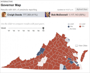
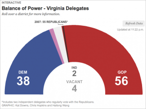
I worked on two graphics for the recent election in Virginia — a map that shows the results of the 2009 governor’s race and election results back to ’97, and a delegates meter showing the balance of power in the VA House of Delegates.

VA Election: Results Map
VA Election: Live Results

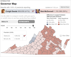
The governor map showed live results throughout the night, and at the end of the night historical results showed up as well, so that users could look at how voting patterns have shifted since previous elections. I think this was really interesting given the speculation about how the 2008 presidential election might impact this year’s race in Virginia.

VA Elections: Historical Data
VA Elections: Historical Voting Shifts

The delegates meter was a quick piece, I just used some circle drawing math in AS3 to create 100 segments in a half-circle, and fill them in as the results came in. When you roll over the segments, you see current results for that district.

VA Elections; Delegates Meter

I made small versions of these graphics to go on our local homepage on Tuesday night and Wednesday morning. They were simplified versions that linked out to the full graphics. I think that was a smart way to push traffic to our graphics on election night, while giving  casual viewers a current tally of results.

VA Election: Local HP