After a long week & weekend of wrapping up the Top Secret America project, we hit the ground running with a project that came out today about local teacher Kevin Ricks. A four-month Washington Post investigation of his career revealed a pattern of abuse that goes back to at least 1978 and has a trail of victims that spans the globe. Reporters Josh White, Jennifer Buske, Michael Chandler and Blaine Harden worked on the story, which was just a great piece of reporting. Go read it!
The timeline tells the story through each place Ricks has been, including maps and a list of schools where he worked in each place. It also has audio clips from a hearing where a German student tried unsuccessfully to get a restraining order against Ricks, and myspace messages that Ricks wrote.
This graphic was done using jQuery and CSS. It uses the ColorBox jQuery plugin for the lightbox effect. The audio players are the only Flash pieces in the project — they’re standard across the site (I built them about a year ago). So check it out on your iPad 🙂
It’s been a little while since I updated the blog, so here are a couple of projects from the past month and a half that I think are pretty cool.
The first is a look back at the aughts that I worked on with Joel Achenbach, which was great because I’ve always admired his work and thought he was hilarious. I designed and build a fairly simple panel graphic that has collages of some major things that happened in the 2000s and will impact our memory of the decade. I think it ended up looking pretty cool and it was a fun look back…
Remembering the decade (washingtonpost.com)
At the end of December I spent a few days working on a new timeline template for washingtonpost.com. I created a new template that improved upon the navigation of our old timeline and allowed more flexibility in text and photo sizing, as well as automatic point placement and the use of points in time and ranges of time.
Reusing the classes I’d created saved a lot of time — it only took a few hours to create this piece. With the improvements we could have a 15-minute turnaround on future projects.
I worked with Sarah Sampsel to create this interactive timeline of Ted Kennedy’s life, which has been used with coverage of his death and funeral this past week.
I said I was going to publish some of my recent work, so here goes. All of this stuff has been done in the past several months and has been published on washingtonpost.com.
I worked on this interactive graphic about North Korean prison camps last month. It explores the five major camps and goes into detail about camp 15. Laris Karklis did the maps, Blaine Harden wrote the text, and I did the design and build.
In April, I worked with Amanda Zamora and Alexandra Garcia on this panoramic timeline of the scene of the shooting of DeOnte Rawlings. It uses three panoramic images, a map, and multiple hot spots to lead the reader through the sequence of events that led to Rawlings’ death. I used the same technology (Flash Panorama Player’s hotspots plugin) for this as I did for the Skipjack pano piece I posted below, but I think this is a much more sophisticated use of hotspot technology.
In April we also launched the D.C. budget game, which people can use to learn more about the city budget and what programs would stay or go with varying levels of funding. Users can save their budgets and compare their choices with other users.
For Barack Obama’s first 100 days, I created this sortable photo gallery that lets readers see exactly what he was doing. Load time is pretty slow, so future iterations will be much leaner.
Scene In: This player for a new series on fashion in D.C. by Alexandra Garcia utilizes the new AS3 video player Jesse Foltz created and features a logo illustration by Noel Smart. I designed the series player and built out the functionality. A new episode comes out every other Thursday.
I was just poking around my old blog posts and realized that this blog is about to turn five years old on June 7. In honor of that milestone, I plan to completely redesign the blog and add some features. I’m also going to be posting some of my more recent work in the next few days/weeks.
I realize my last post was more than a year and a half ago, and a lot has happened in the interim. About a year ago, I started working at washingtonpost.com. I’ve been working on some really interesting projects, focusing primarily on creating interactive graphics, special report pages, and multimedia presentations.
Here are a some examples of multimedia projects I’ve worked on since starting at the Post:
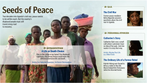
Seeds of Peace: I did this project last July, but I was really happy with the way it turned out. Ben de la Cruz did a wonderful job on these three video stories and a Q&A video, so I had amazing art to work with for the splash page of this piece. A really incredible story of what’s going on in Uganda as civil war continues and people are displaced.
Egypt Panoramas: Post multimedia journalist Alexandra Garcia shot these beautiful panoramas of Egypt on a recent trip. I created this interface, with the pano moving behind the map of Egypt, which also acts as a menu. This project was built totally through XML, so it was really easy to reuse, as we did for the Venice Biennale.
Failing the Chesapeake: This small interactive piece acts as an anchor on the index page of the series. It features a then and now photo piece, a timeline, and several charts showing declining health of the Chesapeake. I also created an interactive panorama from a panorama Whitney Shefte shot of a skipjack, a type of boat used in the Chesapeake.
In the Moment: I did this splash design and set up the video players for this awesome piece the Washingon Post video team did on Barack Obama’s inauguration in January.
Israel Strikes Gaza Strip: During conflict in the Gaza Strip last December, I worked with Sarah Sampsel to create this XML-driven map of Israel that shows attack sites and gives a synopsis of the events as they occurred. We updated this throughout the conflict.
washingtonpost.com
Blood on the Mountain: Also, last summer I worked on this timeline about a murder on the Appalachian Trail. I thought it turned out to be interesting and I like the way the map is incorporated into the timeline. Plus, it’s a fascinating story, which never hurts 🙂
washingtonpost.com
And, to top it all off, my very first project at I worked on at the Post: Explore Nationals Park. This project incorporated video, panoramic images and a stadium rendering that we got from the firm that worked on the stadium, HOK Sport. I designed it and put together the dynamic version of some of the graphics, and Nelson Hsu put it all together. It was a great experience to work on something like this when I first arrived and Nelson was a great person to learn from.
washingtonpost.com
I also plan to (finally) post some pictures from India and some stories about the trip.


![[Politics of the Prize]](http://2.bp.blogspot.com/_1NI9wgirUFw/StC6eqXdCwI/AAAAAAAAAIY/uUAABKBskZc/s400/Picture+1.png)


![[Scene In]](http://3.bp.blogspot.com/_1NI9wgirUFw/Sp86PuFr9MI/AAAAAAAAAGY/vcjW3tiNkTY/s400/Picture+1.png)


![[In the Moment]](http://3.bp.blogspot.com/_1NI9wgirUFw/Spp6yKwuoFI/AAAAAAAAAE0/1fE5fVHmbWw/s400/in-the-moment.jpg)


