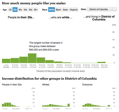
In an extremely quick turnaround, I worked with Dan Keating to create this tool that shows you the breakdown of what other people of your age, race, and location make each year. Hopefully in the future we’ll be able to improve it and add some more metrics, but it’s pretty cool for taking less than a day!
2010 Political Race Maps: House, Senate and Governors
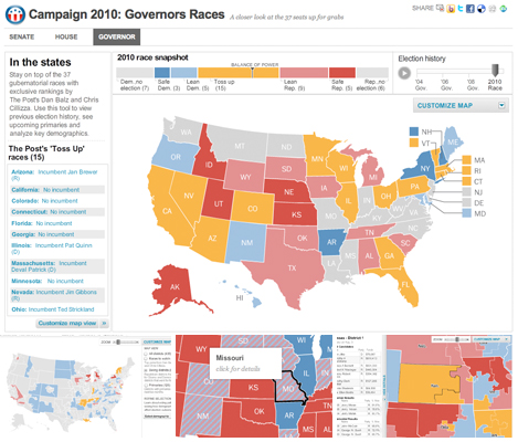
These three new race maps (house, senate, and governors) launched today with the new PostPolitics section of The Washington Post. I worked with Karen Yourish and Dan Keating, who are absolutely amazing data whizzes, to get the data together for the project, and Nathaniel Vaughn Kelso gave me some great base maps to start with. We really wanted to give a complete picture of the 2010 races, so we have current race ratings (for house, we have state of the race), election history for each district or state, and demographic information that lets you see some cool patterns — like how states vote when they have a high percentage of seniors or high poverty rates. Keep reading this post »
New county map: Ultra-high Medicare Billing Rates

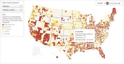
I re-purposed the unemployment map for this story about ultra-high billing rates at skilled nursing facilities in the U.S. It shows where facilities are billing ultra-high rates. The Washington Post found that nursing homes have flooded ‘ultra-high’ billing categories with patients, and the amount of waste and abuse could reach billions of dollars a year. Check out the graphic or read the story by Scott Higham and Dan Keating.

