How well can you spell?

Published in The Washington Post, May 29, 2014

Screenshot 2015-12-12 19.36.37

Role: Concept, writing, design, editing, programming assistance

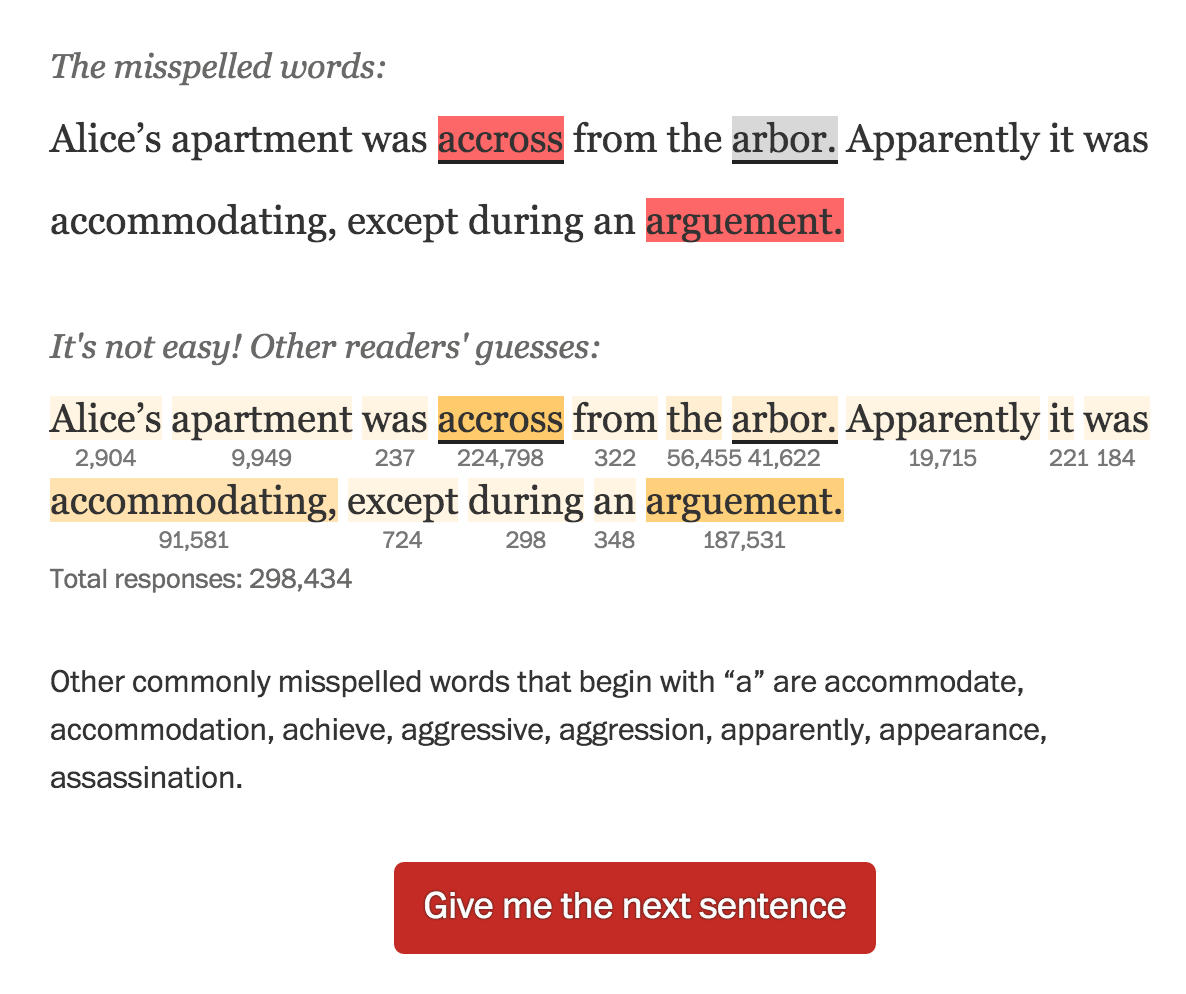
I worked with Emily Chow on this project that tests users’ ability to pick misspelled words out of sentences. The Scripps spelling bee is a popular annual event, and we wanted to make a fun app that capitalized on reader interest in the event. All our competitors were making games that asked you to spell complicated words — not something you’re asked to do every day. But you do read and write every day, and I pitched the idea of highlighting the most common mistakes people make and pushed to develop a piece that allowed users to see mistakes that the other folks who took this quiz made. Emily did the heavy lifting on vote counting development and displays, and I wrote the silly sentences and finessed the design. It got enormous reader response — almost 300,000 readers answered the first question.

Note: If you view this project today, it takes a while for the results to pull in. This is due to dependency on deprecated site services — a lot changes in a year in the news business!

Motion graphics for the 2012 election

Motion graphics for the 2012 election

Published in The Washington Post, 2012

During the 2012 primary season, we started talking about how to tell the story of the election as a whole. I worked with AJ Chavar, video editor, Sohail Al-Jamea, motion designer, and Karen Yourish and Chris Cillizza, reporters, to storyboard and produce this motion graphic, which led our site the morning after Barack Obama won re-election. We did extensive storyboarding to ensure we would be prepared no matter the outcome of the election. I’m proud of this video because it’s fast-paced, has a great storyline and uses compelling graphics and smart visual approaches to keep the viewer’s attention.

Role: Story development, visual editing, producer

Skills used: Storyboarding, visual editing, project management

More election videos:

Homicides map

Published in The Washington Post, Oct. 14, 2012

As I designed this app, I was thinking about how to allow people to quickly find homicides in their area. That led to a decision to focus on neighborhoods. We let people see groupings of crimes that are meaningful to them in both the map and corresponding charts. To surface trends at a city-wide level, we added four promo spots above the map that send people directly to important stories in the app. And a timelapse feature lets people view trends, year by year, across the city and in specific neighborhoods. We’re getting great feedback from users; many people are telling us that they found surprising and intriguing information in the app.

Role: Design, light programming

Tools used: JavaScript, Google Maps API, Flot, CSS

Awards: Gold medal in the SND Digital competition, Silver medal at Malofiej for design

More JavaScript maps: 2010 census, Republican primary tracker, Earthquake in Japan

StoriesFrom.us

Launched on July 7, 2012

StoriesFrom.us

StoriesFrom is a storytelling platform that allows individuals and organizations to create rich, community-driven documentary projects online. The site was made possible through a Knight News Challenge grant from the John S. and James L. Knight Foundation, cosponsored by Google. I built the front end of the site based on designs by Grant Kindrick. The site was optimized for the iPad and included complex gesture-specific functionality like the “wall,” pictured above. I themed Drupal templates to create the story pages (video, slideshow, and text options) and built several other page types, including a map featuring geolocated tweets based on specific keywords, multiple project displays and a complex navigation system.

Role: Front-end development

Tools used: JavaScript (MVC framework), MapBox, PHP, Drupal theming

Note: Due to changes in the Twitter API, the live tweet display is no longer functional.

Coming home a different person

Published in The Washington Post, October 3, 2010

Coming home a different person

Role: Design, programming, production

I worked closely with Whitney Shefte and Alberto Cuadra to create this piece. We storyboarded the intro video, motion graphics segments, and the flow of the piece together, then each created the individual parts. I built the interactivity around the intro page menu, the brain segment, and the package navigation. It features deep linking to each video, gallery, or multimedia segment.

Tools used: Flash/ActionScript 3.0 with audio and video players, Javscript, CSS, SWFAddress by Asual, Adobe Photoshop

Awards: POYi Documentary of the Year, Peabody Award (2010), Online Journalism Award for Multimedia Feature Presentation (large site), Finalist for the Pulitzer Prize for Explanatory Reporting, SND Digital Design competition (Use of Multimedia), WHNPA Eyes of History 2011: 1st Place for Multimedia Package (In-Depth) and 2nd Place for Multimedia Innovation

Is life getting better or worse?

Published in The Washington Post, October 30, 2011

Role: Design, programming

I worked with Dan Keating (database) on this project, which takes a unique approach to user-generated data. It mashes up responses from users with actual numbers on unemployment, median income and population growth to see how people’s perceptions line up with reality. A week after launch we had nearly 5,000 responses. We use IP location to target the experience to the user’s county and state, and ask them to make a rating and, optionally, give us some demographic information and leave a comment. Read more here.

Tools used: JavaScript, jQuery, Quicksand plugin, Echo comments API, Google Visualization API, Bit.ly API, CSS

More user-centered projects: Are you over the hill for Olympic sports?, How does your income compare?

Campaign 2010 Race Maps

Published in The Washington Post, The Telegraph (UK), and Yahoo News, 2010

Campaign 2010 Race Maps

Role: Design, programming

I created these three race maps (house, senate, and governors) to correlate with the redesign of PostPolitics. I also created a live results map for election night. We really wanted to give a complete picture of the 2010 races, so we have current race ratings (except for the House, where we have state of the race), election history, and demographics that let you see some cool patterns — like how states vote when they have a high percentage of seniors or high poverty rates. Favorite features: really cool zoom functionality, which I explain in my blog, and a slider that shows historical results.

Tools used: Flash/ActionScript 3.0

Awards: Bronze, Malofiej 19

More Flash maps: Unemployment by County (read my blog post), A closer look at AIDS groups, Life expectancy across the U.S.

Memories of MLK

Published in The Washington Post, Aug. 24, 2011

Role: Design, programming

I heard that Nikki Kahn and Megan Rossman had been out shooting interviews with civil rights leaders in advance of the unveiling of the Martin Luther King Jr. memorial in D.C., and I approached them with the idea of doing a presentation that combined photography and videos and used the memories of those interviewed to tell the story of King’s life. I organized the memories so that they flowed through stages of King’s life and built up to the building of the memorial. I wanted to let the beautiful photos and powerful video quotes shine, so I went with a simple, clean interface that used strong pull quotes to draw people into the story. I really like the elegant navigation and the ability to share each story.

Tools used: JavaScript, jQuery, CSS, OmniPlayer API

Related: Interactive memorial with Photosynth

i voted

Published in The Washington Post, Nov. 6, 2012

Role: Design, programming

This user-centered project launched on election day 2012. We asked people why they voted, created a customized button for them, then added that button into visualizations based on candidate, geography and topic. I developed the concept for the piece, designed the desktop and mobile applications, and built the mobile application — check it out on your phone! We got over 35,000 submissions.

Tools used: JavaScript, Bootstrap, d3, CSS

rescue and recovery

Published in The Washington Post, April 15, 2012

Role: Design, programming, reporting, audio

This is a really powerful piece looking at Virginia Tech five years after the massacre, through the lens of an iconic image of survivor Kevin Sterne. I did design, development, audio and wrote one of the segments of the piece. I love the simplicity and amazing story. Again, an awesome team effort with work from Ben de la Cruz, Bill O’Leary, Josh du Lac and others.

Tools used: JavaScript, CSS