Washington Post graphics in Best American Infographics 2015

Best American Infographics 2015

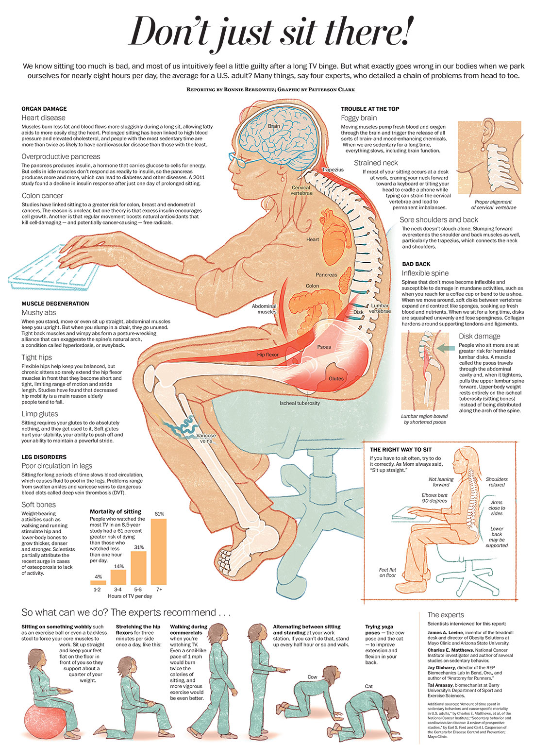
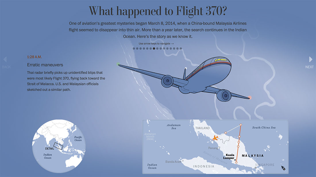
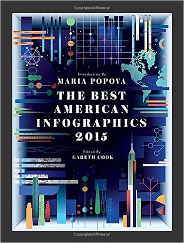
The Best American Infographics book, edited by Gareth Cook, came out in October. The Washington Post had our best showing yet, with 10 of our graphics featured. The best thing is that so many of our @PostGraphics team members are represented — at least 11, which is about half the team!

A few pieces that were featured that I edited:

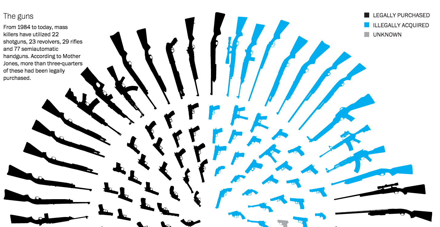
Weapons and mass shootings: Richard Johnson, Bonnie Berkowitz, Ted Mellnik, Todd Lindeman and Kennedy Elliott
Screenshot 2015-12-12 21.12.04

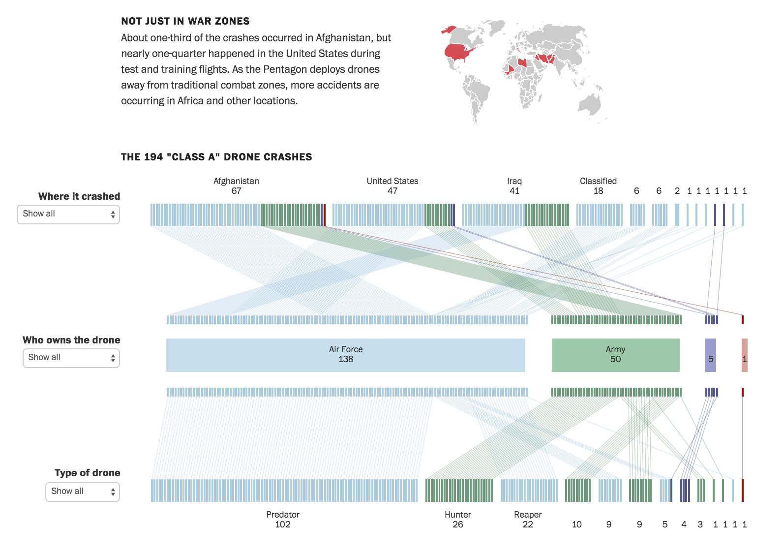
When drones fall from the sky: Alberto Cuadra and Emily Chow
Screenshot 2015-12-12 21.02.31

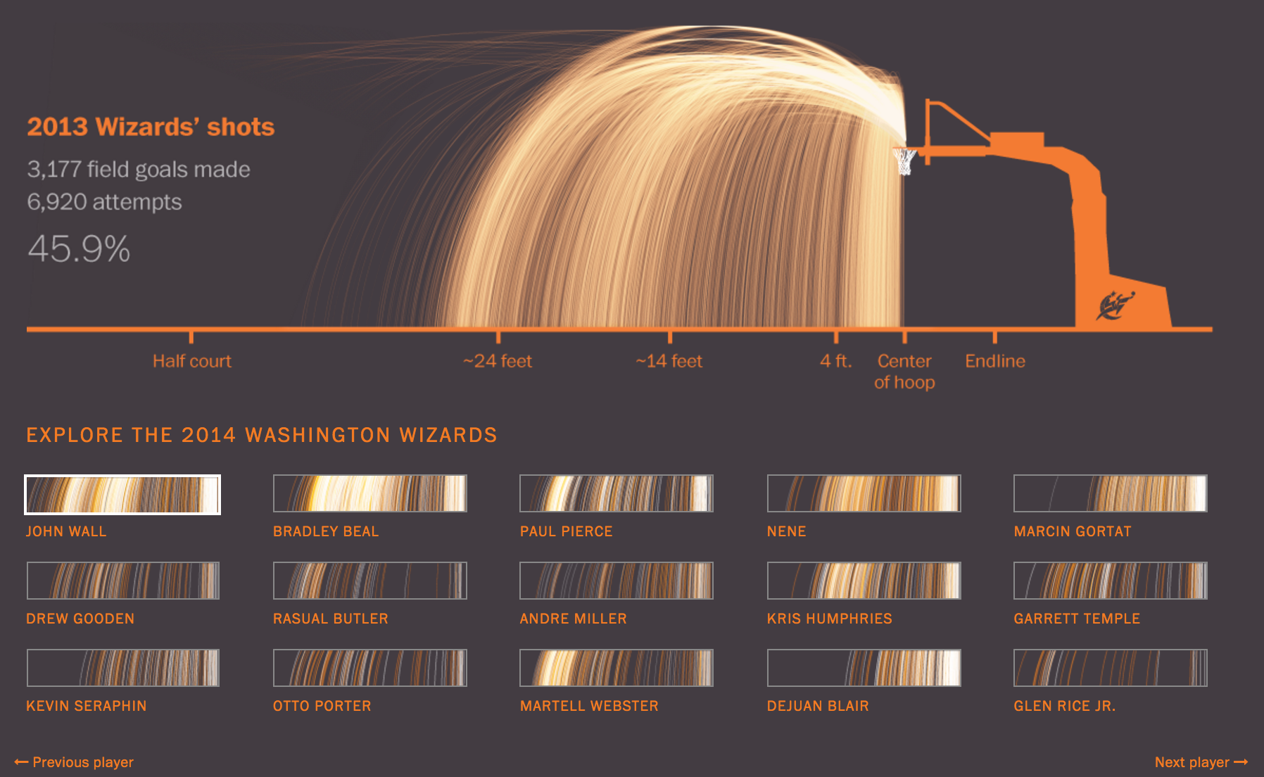
Wizards shooting stars: Beautiful work from Todd Lindeman and Lazaro Gamio
Screenshot 2015-12-12 21.06.01

Inside the Clinton donor network

Published in The Washington Post, Nov. 19, 2015

Clinton donors

Role: Project management, graphics and design editing, light development

Awards: Silver medal in the SND Digital competition

This project, the result of many months of detailed data analysis and reporting, was the product of a wonderful collaboration between reporters, designers and developers. My team was responsible for the graphics, template design and full-stack development. I helped refine and edit the graphics and overall design, keep the project on schedule and stakeholders informed, and develop and style small front-end components.

Exodus: The Black Route

Published in The Washington Post, June 26, 2015

black-route

Design Director Greg Manifold and I prototyped an experience for this story. We wanted to emphasize the exceptional photography and make the introduction highly visual, captivating and emotional. We hoped that would hook readers into a deep reading experience. I suggested contextual mapping: when a place is mentioned in the narrative, it is highlighted in the accompanying map. Emily Yount, Emily Chow, Seth Blanchard and Lazaro Gamio took the rough prototype we built and transformed it into this wonderful project.

Role: Design, concept, prototyping

Awards: Award of Excellence in the SND Digital competition

More story design/editing: The N-word, Prophets of Oak Ridge, Cycling’s road forward

Favorite work from 2014

Some of the projects I’ve loved this year:

Health hazards of sitting: One day I said to Bonnie that we should do a graphic about how bad sitting is for you (was feeling bad about sitting all day!). She, as usual, simply said “I’ll look into it” and then, with Patterson’s help, made this amazing thing, which was one of our most popular pieces of content this year.
sitting

Pistorius affadavit: I developed this project that has some amazing artwork by Todd Lindeman and Richard Johnson
pistoirus

Flight 370 timeline: I developed the little locator map on this project!
20140323-MalaysiaAir

Secret service: Sam Granados had the vision for this project, which is a smart mix of media types that tells the story of the night bullets hit the White House and the Secret Service didn’t know. I helped with some of the design and development of the piece.
20140928-WhiteHouseShootings

Intensive Care for a Damaged Dome: Fantastic project by Alberto Cuadra, Sohail Al-Jamea, Katie Park and Kevin Schaul that I edited.
Screenshot 2015-12-12 23.22.40

Election Lab: Fun election project designed by Kennedy Elliott that I edited:
2014-10-28 14-electionLab

The N-word project

201411-NWord

This project, which was nominated for the OJA for Excellence and Innovation in Visual Digital Storytelling, was months in the making. It happened only through an enormous amount of collaboration between people from different desks, disciplines, races and perspectives. We decided to examine the history of this word after the NFL instructed game officials to penalize players who used the word on the field. The policy was widely criticized as being heavy-handed and out of touch. We wanted to start a conversation about the word and to bring in the voices of all kinds of people with different perspectives on this word and the ways it is used today — whether and how it should be used, who can or should use it, what it means in people’s lives.

Inside the newsroom, the project brought together a wonderfully diverse group, who spent months exploring the best way to tell this story, ultimately deciding that we wanted to present it through a series of conversations that brought people together to talk about things they might not normally be comfortable talking about. We created something that we all felt proud of, that opened us up to conversations among ourselves that challenged our assumptions and taught us all more about each other. It gave our readers a place to start asking uncomfortable questions and talk about what this word means in their lives.

How well can you spell?

Published in The Washington Post, May 29, 2014

Screenshot 2015-12-12 19.36.37

Role: Concept, writing, design, editing, programming assistance

I worked with Emily Chow on this project that tests users’ ability to pick misspelled words out of sentences. The Scripps spelling bee is a popular annual event, and we wanted to make a fun app that capitalized on reader interest in the event. All our competitors were making games that asked you to spell complicated words — not something you’re asked to do every day. But you do read and write every day, and I pitched the idea of highlighting the most common mistakes people make and pushed to develop a piece that allowed users to see mistakes that the other folks who took this quiz made. Emily did the heavy lifting on vote counting development and displays, and I wrote the silly sentences and finessed the design. It got enormous reader response — almost 300,000 readers answered the first question.

Note: If you view this project today, it takes a while for the results to pull in. This is due to dependency on deprecated site services — a lot changes in a year in the news business!

Motion graphics for the 2012 election

Motion graphics for the 2012 election

Published in The Washington Post, 2012

During the 2012 primary season, we started talking about how to tell the story of the election as a whole. I worked with AJ Chavar, video editor, Sohail Al-Jamea, motion designer, and Karen Yourish and Chris Cillizza, reporters, to storyboard and produce this motion graphic, which led our site the morning after Barack Obama won re-election. We did extensive storyboarding to ensure we would be prepared no matter the outcome of the election. I’m proud of this video because it’s fast-paced, has a great storyline and uses compelling graphics and smart visual approaches to keep the viewer’s attention.

Role: Story development, visual editing, producer

Skills used: Storyboarding, visual editing, project management

More election videos: